Matrix Group International

Author: Alex Pineda

  • Top 5 Web Design Trends for 2021

    Top 5 Web Design Trends for 2021

    It’s safe to say that, thanks to the pandemic, our lives are lived online now more than ever before. The more time we spend in the digital world, the more the lines are seeming to blur between physical and virtual, lending way to some exciting new web design trends. Here are the 5 trends that I think will be most popular in 2021:

    1. Neumorphism


    Neumorphism example
    Twitter header of Marques Brownlee

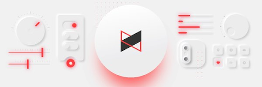
    The death of “skeumorphism”, or the digital equivalent of “real-world” surfaces and objects, gave rise to “flat” design that has dominated UI design for a few years now, famously championed by Jony Ives, former design director of Apple. The inevitable backlash to flat design is a trend back towards more “realistic” interfaces, but far short of full skeumorphism. This “neumorphic” trend features elements that rise subtly from the background, (e.g., gentle shadows), and are far more subdued than pure skeumorphic digital objects. While more prevalent in app design, these neumorphic elements are popular on the web as well.

    2. More lives lived online, more integrated experiences


    virtual event features

    2020 saw us working remotely, avoiding close contact with other humans, and sheltering in our homes. The COVID crisis has had an enormous impact on our daily lives, and how we do business. Matrix Group is, of course, no exception – we’ve had to change our way of interacting with our teams, serve our clients, and craft interactive experiences. For our association and non-profit clients, one of the biggest challenges was how to hold conferences and annual events in the year of COVID and non-gatherings. To address this challenge, we at Matrix Group created a virtual event platform called BeSpeake, with the goal of having virtual meetings that are more than just a bunch of video conference windows, but a space to still have meaningful interactions with members, vendors, and sponsors. This trend of integrating live video, multimedia presentations, chat, and data is continuing to evolve as we need digital tools to replace what was done face to face, but now is increasingly done virtually.

    3. Less rigid layouts

    example of less rigid layouts

    Since the earliest days of the Internet, web design has always been a grid-based experience, due to the limitations of, at first, table-based HTML layouts, then CSS. The ability to freely place elements anywhere on the canvas has been something that we web designers have always envied from print design. This limitation is gradually being removed, however, through more advanced CSS and the latest browser support. Asymmetric grids, overlapping elements, and even randomly-placed objects are in vogue, and are a welcome respite from the usual, rigid layouts of most web pages. My hope is that someday soon, we can design as fluidly as print designers, and web designers will have the freedom to create as we see fit, not limited by code or browser technology.

    4. The horizontal scroll is back!

    Gelataria Amande Website Screenshot

    Horizontal scrolling was once popular, then became a huge no-no; but it’s making a comeback. Perhaps the resistance has been eroded by the mobile experience, where apps frequently use the horizontal swipe interaction to scroll content. There are many more sites using horizontal scrolling, such as this site for Italian gelato. We at Matrix Group have done a few recently for clients, including a recent project for FMI’s Food Prices report. For good usability, it’s key to make sure to have clear controls for the horizontal scroll, such as arrows, or to allow for the mouse scroll wheel.

    5. 3D elements

    The Year of Greta website screenshot

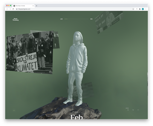
    3D elements are becoming increasingly used on websites, whether in the form of rendered illustrations or an actual 3D-like environment. One of my favorite recent sites is the Year of Greta, where the interaction is a virtual experience based around a 3D statue of Greta Thurnberg. As you drag your mouse, the statue rotates and video windows appear that commemorate the 2019 moments of Greta’s fight for climate change. The use of 3D can be gratuitous, but I feel in this case, it was used well, and a fitting testament to a courageous young woman fighting for our environment.

    2020 was a tumultuous year, with disruptions on many fronts. One of the main missions of a designer is to bring visual order to chaos, to facilitate communication, and to create experiences that entertain, educate, and illuminate. All these “trends” reflect advances in technology, stylistic evolutions, and so on, but ultimately, they are a means by which we hope to bring joy to our clients and our audiences. Here’s to a more joyful year ahead!


  • Top 5 Web Design Trends for 2020

    Top 5 Web Design Trends for 2020

    Guest post by Alex Pineda, Matrix Group Creative Director

    New year, new possibilities, especially in web design. With technology advancing at an unprecedented rate, design possibilities seem limitless in the coming year. What do I think we’ll see, design-wise? Here are my predictions for the top 5 web design trends in 2020:

    Progressive Web Applications (PWAs)

    A progressive web application combines the best of both web and mobile apps – think of it as a website built using web technologies (i.e., HTML, CSS, etc.) but acts and feels like an app.  Since PWAs are a technically a website, there is no need to go through digital distribution systems like the Apple App Store of Google Play, making it simple to deploy and disseminate.

    The major advantages of PWAs are (per Wikipedia):

    • Progressive — Works for every user, regardless of browser choice, using progressive enhancement principles.
    • Responsive — Fits any form factor: desktop, mobile, tablet, or forms yet to emerge.
    • Faster after initial loading – After the initial loading has finished, the same content and page elements do not have to be re-downloaded each time.
      • Ordinary websites often already made use of the browser cache to avoid re-downloading the same data redundantly. But on progressive web applications, the same elements do not need to be re-rendered again.
    • Connectivity independentService workers allow offline uses, or on low quality networks.
    • App-like — Feels like an app to the user with app-style interactions and navigation.
    • Fresh — Always up-to-date due to the service worker update process.

    The term “Progressive Web app” was first coined in 2015, and by 2019, there are an increasing number of companies that use PWAs as the means to distribute their services and content, including Twitter, Pinterest, Trivago, Tinder, etc.  As the barriers to entry decrease for creating PWAs, we can only expect more companies to release their own.

    Design for Accessibility

    In the past year, there has been a great deal more care being given to designing experiences that are accessible to as many users as possible.  Microsoft has been a champion of this movement, coining the term “Inclusive Design”, using this definition:

    “Inclusive Design is a methodology, born out of digital environments, that enables and draws on the full range of human diversity. Most importantly, this means including and learning from people with a range of perspectives.”

    To design accessible experiences, keep these things in mind:

    1. Think carefully about your audience – consider who is being included, and who is being excluded.
    2. Ensure your interface provides a comparable experience for all so people can accomplish tasks in a way that suits their needs without undermining the quality of the content.
    3. There are basic principles to follow that enable the best user experiences for the greatest number of people.

    Light vs. Dark Mode

    The ability to switch between dark and light modes has long been available on the MacOS, and with Windows 10, for PC users as well.  I personally tend to use dark mode as it’s easier on the eyes over long periods, and I switch to dark mode on my iPad out of consideration for my sleeping wife.  This ability to switch between modes also applies to your web browser, on Chrome or Safari, and yet this mode didn’t affect the overall style of the actual website.  There is a way on Google Chrome to forcibly turn any website into dark mode, but increasingly, that will no longer be necessary.

    Developers are now working with toolkits and standards, on both Safari and Chrome, that enable your browser to detect which mode (light vs. dark) you are using on your OS, and switch the color scheme on the website to react accordingly.  It will be the responsibility of the website creators to decide if they want to enable this on their site, and how best to adopt a style that works for both. There are a number of guides and tips out there on how design for dark mode, that can help designers and developers take advantage of this new ability, and let users decide for themselves what they prefer.

    Oversized Type & Big Elements

    Websites, particularly for top brands, are favoring large prominent elements – from oversized typography to full screen images, usually a combination of both.  Huge elements like this make a bold brand statement, catch the user’s attention, and help them understand what the site is all about.

    In order to make this approach work, a minimalist approach is necessary.  Reducing the content to a single image (or video) + a short title makes for a clearer message, and an uncluttered experience.  Less is more, but make a big statement!

    Illustration as the Brand Personality

    Rather than relying on stock imagery or a generic photo, brands are using tailored illustrations to convey their brand personalities.  My favorite example of the use of these illustrations comes in the form of the 404 Not Found pages such as:

    The key to using illustration successfully relies on their uniqueness and consistency.  If you have the budget, hire an artist whose work you think matches well with your brand vision – dribbble and other artist portfolio sites are a good way to find them.  If you don’t have the time or budget to commission an artist, there are a plethora of vector art libraries on sites like istock or gettyimages, just find collection that has a good number of illustrations to serve your needs.

    Which design trends are you most excited about in 2020? 


  • The Inflection Point

    The Inflection Point

    As I write this, I’m currently watching the live event of Apple’s latest iPhone 8 event. They just announced an update to the Apple TV set top box, with support for 4K, because, according to Tim Cook, “TV is at an “inflection point” with the mainstream adoption of 4K.”

    This made me ponder the implication of this term “inflection point”. By definition, in math terms, it’s “a point of a curve at which a change in the direction of curvature occurs.”  In Tim Cook’s reference, it’s when a technology reaches a certain critical mass in terms of how many people use it, hence Apple’s new product.

    In larger, cultural terms, an inflection point represents a fundamental change in how people live, do business, communicate.  On the NY Times website, there is a video of all the things the iPhone “destroyed”, in terms of how it disrupted whole industries, and changed how we interact with each other:

    The list of disruptions engendered by the rise of mobile technology is enormous, including the taxi industry, alarm clocks, cameras, etc. Every organization is faced with the potential of disruption, with the inflection point. The key is to anticipate this disruption, and embrace it, to evolve, rather than die. History is littered with industries and companies that could not embrace change and fell by the wayside.

    Since I’ve been with Matrix Group (1999), there have been a huge number of inflection points, both culturally and technologically. Every time there is a major fundamental change, we’ve had to adapt our design process, business practices, and offerings to clients. From desktop to mobile, cloud computing, content management systems, these new technologies have all had huge impacts on our business, and how we help our clients.

    Some of the new potential inflection points include the internet of things, virtual reality, screen less experiences etc.  As a company that designs interactive experiences for our clients, it’s imperative that we stay on top of these changes, embrace these changes, and think about how we can apply these inflection points to help our clients evolve and thrive, and not die.