Matrix Group International

Tag: Web Design

  • Can AI Create Your Website?

    Can AI Create Your Website?

    AI tools like Canva and ChatGPT promise fast, DIY website creation, but are they good enough for organizations with complex needs? This post explores what AI can (and can’t) do when it comes to website design, development, and content. From the convenience of AI-generated layouts to the irreplaceable value of human expertise, discover when AI might be “good enough” and when it’s just not the right fit.


    I recently saw an ad about how Canva can create a website with AI minutes. Canva allows customers to select a template, create images, and have AI create the content.

    I am a big Canva fan, so I got curious. Is this really possible? I went to Canva.com and decided to try and create a website for the book I’m writing about associations. Canva has some impressive options, but let me tell you, I still didn’t have a website after 45 minutes. Why? Because the choices were too overwhelming, I couldn’t find something that looked unique enough for my taste and I don’t know the Canva controls enough to create something that matches my personal brand or the Matrix Group brand.

    What about someone who IS really good at Canva? Could they create a website in minutes? Maybe not minutes, but maybe a few hours? Today, the answer is probably yes.

    BUT, will it be any good? 

    Today, the answer might be, it depends. It’s possible that AI can create a website for you or your organization that is good enough. But here are some things to think about:

    DIY (do it yourself) tools have always been great options for people and organizations that know exactly what they want. I used blogger.com to create a website for my personal podcast, KDramaChat.com. Is it amazing and unique? No, but it’s good enough. We’ve helped clients select a pre-built theme in WordPress for a conference and with a little setup, they were off to the races!

    But what if you need something more than a simple blog site or one-pager about something you’re fighting in Congress? Or a website that represents your entire organization, its values, its initiatives, and its impact?

    In my experience, our clients come to us because they have a vision or an inkling of what they want, but they don’t know how to get there.

    Often, a website redesign is a proxy for a conversation about who or what the organization wishes to become. So we use tools like interviews, analytics, mood boards, wireframes and design to help clients explore and ultimately decide what their end goal actually looks like. And many times, the conversations about what the website should look like, what content should get priority, and what the website should look like, have to be moderated by people who know how to achieve agreement between people of differing opinions. (My Project Managers excel at this.)

    I’m more and more impressed by what AI can do with images, videos and logos these days. BUT, more often than not, what AI creates needs to be massaged to make it better, to give the output authenticity, to make the designs have depth and personality.

    THIS depth and personality comes from skilled designers. At least for now, nothing beats the experience and eye of someone trained in design and branding. My designers absolutely use AI tools but they don’t rely on them exclusively. Sometimes they just need a little inspiration, sometimes AI gives them a base they can tweak into something fabulous, and sometimes they have to just do the work entirely on their own.

    My front-end and back-end developers are increasingly using AI code generators to help them build out website functionality. Whether it’s a custom post type, a directory, or an integration with a membership database, the code generators have come a long way. We’ve seen great productivity gains in this area. The catch here is that we’ve had to train the code generators on OUR coding standards and our code repository, AND every developer is still responsible for reviewing their work and having others test it.

    We joke at Matrix Group that we can often tell when content is AI-generated. AI loves to embark on things, or delve into things. Yeesh. Who talks or writes like that? I also find that AI content is often full of extraneous adjectives. The content might sound good, but it’s sometimes off brand, or way too flowery for my taste. Even worse, those adjectives can get us in trouble because they just aren’t true.

    Again, don’t get me wrong. I use AI tools for brainstorming and drafting, but what Gemini or chatGPT generates is never good enough, not for a writer like me, and, I suspect, not for my discerning and extremely professional clients. 

    By the way, I tried really hard to get AI to draft this blog post and it just couldn’t do it. I’ve had luck with other topics, but even when I provided detailed prompts and guidance, the end result sounded off. I guess some topics are still too nuanced for AI.

    I don’t think so, and I hope not. I think we still need trained and experienced professionals to develop the strategy, create the design, build the site, and write the content that will compel people to read more, join, register, purchase, or otherwise engage. 

    AI is a great companion for creating the designs, programs and content that make up our websites today, but we should still be the leaders of these web development journeys.

  • New Year’s Resolutions For Your Website in 2024

    New Year’s Resolutions For Your Website in 2024

    It’s the New Year and all of us are bubbling over with resolutions. So many of us resolve to exercise more, be kinder, spend more time with family, and so on. What about our websites? Shouldn’t we have resolutions for making our websites, email, and social media accounts better?

    I am a big fan of Dan Pink, author of the best-selling books Drive, When, The Power of Regret, and so many others. He also has a video podcast that he calls the Pinkcast. Each podcast is only 2-3 minutes long and they’re full of amazing insights and advice. In this Pinkcast, he talks about how to make New Year’s resolutions like a pro. The process includes making a list of your regrets, picking the one thing that bugs you the most, and then focusing on just that in the new year.

    What Are Your Website Regrets?


    Getting back to your website, what are your regrets about your website from the last year? Here is what I hear from clients. They wish:

    • They blogged more often
    • They had better visuals on their website
    • They had cleaned up their website by deleting the old stuff and making sure what was left was current and fresh
    • Their website was better optimized for mobile
    • They had a better handle on their website analytics and what it means for their organization
    • Their content was better optimized for Google
    • Their site search was better
    • Their website did a better job of storytelling
    • Their join or registration process was easier
    • Their website templates were more flexible

    This is a pretty long list of regrets. Each of the items above is important and worth focusing on. BUT if you focus on all of them, it will be sometime before you see progress. AND not making any progress on your goals and resolutions early in the year could set you up for another year of regrets. So how and where do you start? 

    Pick 1 or 2 Regrets to Focus on in 2024


    Start by picking just one of your regrets, or maybe even 2, and turn them into goals. Which one is most important that if addressed, would yield the most benefit for your organization? 

    The key here is making specific enough goals that you end up with an action plan and a timeline. 

    For example, if one of your goals is to make your organization’s join process better, your action plan might have these steps:

    • Look at Google Analytics to see what kind of traffic the join page gets and where people abandon.
    • Meet with your membership database and marketing team to map the member join process and map the journey. Where are the friction points?
    • Ask your web team, AMS team or website vendor for suggestions for making the journey better.
    • Resolve to have something, anything done, by the first quarter of 2024.
    • Monitor the results weekly.
    • Repeat until the next set of improvements will bring in only marginal benefits.

    If your goal is to clean up the dead and outdated content on your website, your action plan might look like this:

    • Ask your web manager or web vendor to create an updated inventory of all of the content on your website.
    • Look at your Google Analytics to see where traffic is going and where it’s not going.
    • Do some searches on your site. Is old content dominating the results?
    • Resolve to make some decisions about 5 types of content, eg., news, blogs, annual meeting information, etc. A decision could be: Delete all but the last three years of news, or delete all but the last two years of annual meeting information (except session handouts, which will live in a separate database).
    • Set aside 1 hour per week to do this work. If you set aside too much, it will become onerous. If you allocate less time, you won’t make enough progress.
    • Distribute the work to a team of staff and monitor your work and results monthly, including whether and how traffic and site search are improving.

    Once you’ve got one one of your regrets tackled (at least for now), tackle the next one. And so and so forth. 

    Of course, your organization could opt for a total website redesign, which would presumably help you tackle a whole lot of regrets, challenges, and issues. Barring that, however, focusing on one thing at a time will give you the mental energy to actually make a difference on that item that’s been bugging you.

    What are your biggest website regrets from last year? What “regrets” are you planning on tackling first this year? Leave a comment and let us know!


    Need some help planning, strategizing, and/or getting the right technology in place to reach your goals and clear your year of regrets? That’s our expertise! We’d love to partner with you to help your organization thrive this year – in the digital space and beyond. Get in touch and we’ll schedule a time to tackle those “regrets” together!

  • When Do Your Customer Journeys Actually Begin?

    When Do Your Customer Journeys Actually Begin?

    I have two friends who have walked the Camino del Santiago. The friends are Peter Schwartz, who is my business coach, and Gordon Bernhardt, a member of my CEO peer group. Both of them did the French route, which takes you from St Jean Pied de Port to Santiago de Compostela. It’s a 500-mile journey that you do on foot over 30 to 35 days.

    My friend Gordon’s journey began when he walked out of his hotel room in France and started his Camino journey. He said something really interesting to me when I was talking to him about the Camino. He said, “Joanna, back in the day, if you were a pilgrim a couple of hundred years ago, your journey actually began when you walked out of your house in Germany or some other part of Europe, wherever you might have been.”

    Joanna Pineda and Gordon Bernhardt
    Joanna with Gordon and his book, Buen Camino

    This comment from Gordon got me thinking. I am in the business of helping associations and nonprofits create amazing member journeys. My company creates online shopping carts, online meeting registration forms, resource centers, etc. All of my clients are concerned with creating seamless and effective customer journeys so that their members and non-members find what they’re looking for, purchase the items they’re looking for from the store, or register to attend a conference or seminar.

    The question is: when do these customer journeys begin? Do they begin with the customer at the point of registering for a meeting or at the point of adding something to the shopping cart? Or do they begin when the customer starts with a Google search, clicks on a link in an email, or has a conversation with a friend about something that they might need?

    I believe that we all need to think of these customer journeys as starting much, much earlier. When a person ultimately registers for a conference, that attendee journey probably started days, weeks, or even months before the actual registration. It started when they had a conversation with their boss, did a Google search, or visited the website.

    When thinking about your customer journeys, ask yourself and your web team: 

    • How do people find whatever it is we’re trying to sell them or whatever it is we want them to use or do on our website? 
    • How findable is a specific product in our store on Google? 
    • How findable is a specific webinar from our site search, especially when a person doesn’t have the exact title? 
    • How findable is a specific resource on your website that perhaps was mentioned during a keynote presentation or a webinar?

    And even though you may not have complete control over the platforms they start their journey on – Google, email, social media, etc. – there are things you can do to make those touch points better. For example, to improve the journey from search to your store you can: 

    • Talk to your web team to make sure that every product in your store is actually indexable by Google. 
    • Make sure that each product has good navigation. 
    • Make sure that each product actually has a primary link URL, and each product page has a URL. 

    When we do these things, we make it easier for Google to find our products and also make it easier for the site search to find products.

    The next time you’re thinking about a product or service that your organization has to offer, think about the customer journey and when exactly those journeys begin. 

    Chances are you need to go much, much earlier in the process to make that journey better for your customers.

    Need help rethinking and retooling your member journeys? Let’s talk! We’d love to help.

  • What is the Best Content Management System For an Association Website?

    What is the Best Content Management System For an Association Website?

    We get a lot of RFP (Requests for Proposals) for association and nonprofit website redesigns. Often, one focus of the RFP is the technology that will power the new website. These RFPs have giant lists of requirements related to how content will be authored, formatted and published. 

    We often get asked this question: 

    What is the best content management system (CMS) for association websites?

    The answer (you guessed it) is always gonna be, “it depends.” Depends on what?, you might ask. 

    The dirty little secret of website development today is that nearly all content management systems in the market will meet nearly all of any organization’s requirements. While this wasn’t the case 10 or 15 years ago, this class of software has matured a lot and nearly all will allow you to:

    • Add items to recurring collections of content
    • Author uniquely designed pages
    • Easily add formatting, images, and video to pages
    • Categorize content
    • Manage workflow
    • Schedule and embargo content
    • Create public and protected content
    • Consume content via APIs or imports
    • Optimized website content for Internet search engines

    So how does an association decide between content management systems? 

    Here are some ways that we’ve helped our clients choose a system that’s right for them.

    • Understand the development capabilities of your staff. Some CMS systems have friendlier drag and drop authoring systems, while others require a bit or a lot of knowledge of CSS (cascading style sheets).
    • Does your IT department require a specific tech stack? We’ve run into IT departments that prefer a Microsoft tech stack, while others prefer open source. Most of our clients don’t have a preference, but your organization may, so it’s best to check with those in the know.
    • Your staff may prefer certain features or interfaces. Just as people are drawn to specific models and makes of cars (and yet, they all take us where we need to go), some staff may be turned off by some systems that have a very tech user interface, while others will love it. I guess this is why some people prefer the Apple design style, while others like Google.
    • Budget is often a consideration. While we find that implementation costs are largely similar between systems (because the implementation work is quite similar between systems), licensing and hosting costs can vary widely between systems. Open source systems don’t have licensing fees, and hosting in a Linux environment is less expensive than hosting in a Microsoft environment.
    • Does your tech ecosystem require a specific tech stack? This doesn’t happen as often anymore, but sometimes, we run into projects where third party partners require a Microsoft tech stack. Examples are when a vendor requires SAML authentication, or SOAP for single sign on.

    As a company, we do website implementations in WordPress, which is an open source content management system, and Sitefinity, which is a Microsoft.NET based system. Matrix Group designers say that they design sites with no consideration for the CMS that will ultimately power their designs. Our front-end developers say there are, of course, differences between how you implement a site in WordPress or Sitefinity, BUT they can make both systems do exactly what they designers and information architects envisioned.

    And yes, we implement sites in other systems, and the art and science behind why a specific system is chosen will ultimately depend on functional requirements, design requirements, user interface preferences, and budget considerations. 

    Looking for a new system for your association or wondering what else is out there? Perhaps you’re wondering if your current system was implemented properly. We’d love to hear from you!

  • Set 2023 Up for Success: 7 Easy Upgrades to Make

    Set 2023 Up for Success: 7 Easy Upgrades to Make

    Looking for a few easy upgrades that are light on the budget but will start you off strong in 2023? Matrix Group Creative Director Alex Pineda and Lead Front-End Developer Jaime Quiroz have suggestions for a few simple upgrades and updates you can make that will improve your user experience, give you more accurate data, and help you better serve your members.

    1. Pick one template that you use often, and update it

    We live in an era where new and fresh is not just preferred but expected. Keep your brand and assets fresh by auditing and updating one or more of your most-used templates. This could be a template for your: newsletter, PowerPoint presentations, meeting pages, PDFs, press releases, or social media posts. Little tweaks like this can make a big difference, and good designers should be able to do this work fairly quickly. 

    2. Refresh the most visited page on your website. 

    Google loves it when you update your pages, and your users do, too! Take a look at your most visited page, and ask yourself: 

    • What images could we replace to make this page more high-impact? 
    • What can we reduce to increase clarity on this page? 
    • Is the page too cluttered; what can we do to make it simpler? 
    • What is the goal of the page? Is there a clear flow to the call-to-action to meet that goal?
    • Why is this page so popular? What other content can we feature that is connected to the popularity of this page?
    • Is there any industry jargon on the page that needs to be reworded? 

    Even updating two or three little things can make a big impact! 

    Not sure which page is your most-visited page? Take a look at your analytics. If you’re not sure how to do that and need help, maybe now is also a good time to invest in some Analytics training. Speaking of Analytics…. 

    3. Upgrade to Google Analytics 4 

    Google Analytics logo on laptop screen

    If you haven’t upgraded to Google Analytics 4 (GA4), you need to upgrade as soon as possible! Google is sunsetting Universal Analytics on July 1, 2023. Due to the new data model in GA4, you won’t be able to move your data from UA to GA4 and data between UA and GA4 won’t be comparable. You need to start collecting your data in GA4 yesterday to have the comparative reports you’ll need next year. (Psst, if you need help getting GA4 installed on your site or want training on the new interface, we can help!)

    If you already have GA4 installed on your site (bravo!) we recommend investing in one Google Data Studio custom report. Google Data Studio lets you create beautiful dashboard reports that aggregate data and reports so you can see and understand your data more clearly. 

    4. Update link text and button text on your website to improve accessibility and usability. 

    It’s important to make your link text and button text as descriptive as possible on your website. This is important for usability, but even more important for accessibility. People who use screen readers (e.g., people who are blind or low vision) need descriptive links or button text so that they know how to execute an action. For example, a link that says Click here is not useful to screen readers; “Register now” or “Read our annual report” is more helpful. 

    The icing on the cake: this practice is also great for search engine optimization. When you link the whole phrase, your sites gives Google and other search engines better clues about what your content, page, and links are about; this can help boost your authority and ranking. 

    5. Take your most important PDF and turn it into an HTML page.

    Why? For so many reasons. Search engines can’t tell from a PDF what your content is really all about because all of the text is treated equally; PDF pages are lacking H tags that provide a hierarchy for what the page is all about. In addition, PDFs are not good for accessibility, they’re not mobile friendly, and they’re not easy to update. Yes, you have more design control with a PDF, but you need to consider all of the other factors at play. Converting your most important PDFs to HTML pages will drastically improve usability, accessibility, and SEO.

     If you can’t do away with the PDF completely, a great option is to convert what you can to an HTML page, and still make the PDF version available. A great example of this is ERISA Industry Committee’s Policy Priorities document that they turned into a web page, while still making the PDF available. See ERIC’s Policy Priorities web page here

    6. Increase security by using and requiring 2-factor authentication

    If you haven’t already, we beg of you: install 2-factor authentication for EVERYTHING that you can, and update your security policy to require it. Yes, it can create a minor inconvenience – maybe add 15 seconds to a log-in process – but those few seconds might be the very thing that saves your organization from being completely compromised, which would cost you a lot more time. 

    7. Improve your search by adding 10 more best bets

    For your top 10 most searched queries on your site, are your users getting to where they need to go? One way to make sure they get where they want to go, or where you want them to go, is to update your best bets to serve better results. Best bets, or featured results, tell your search engine that for specific keywords or phrases, you want X and Y pages to be at the top. For example, if someone types the word “awards” into your site search, they might get a jillion results, but what they probably want is your awards landing page, so set up a best bet for the awards landing page. Start by looking at your search analytics, determining the top 10-15 searched words or phrases, and adding best bets for those words and phrases. This is a quick and easy thing to do, but has the potential to drastically improve your users’ experience with your site. 

    BONUS: Update your 404 page

    Your 404 page is a great place to have a little fun on your website, and provides a low-stakes opportunity to show a little personality and reinforce your branding in a new and different way. For example, FMI – The Food Industry Association’s 404 page says “Clean up on Aisle 4!” something often said in their grocery store members’ day-to-day. At Matrix Group we’re big Star Wars fans, so check this out: https://matrixgroup-wp-new.matrixdev.net/whoops 

    If you have some extra budget left to spend in 2022 or are looking for quick wins for the start of 2023, we hope these suggestions help! If you want to dive deeper into any of these ideas, you can watch the recording of the webinar we held last week on this topic or reach out to our team, who would be happy to continue the conversation. 

    Remember, little things add up and can make a big impact! 

    What projects are you planning to tackle in 2023, big or small?

  • Top 5 Web Design Trends for 2021

    Top 5 Web Design Trends for 2021

    It’s safe to say that, thanks to the pandemic, our lives are lived online now more than ever before. The more time we spend in the digital world, the more the lines are seeming to blur between physical and virtual, lending way to some exciting new web design trends. Here are the 5 trends that I think will be most popular in 2021:

    1. Neumorphism


    Neumorphism example
    Twitter header of Marques Brownlee

    The death of “skeumorphism”, or the digital equivalent of “real-world” surfaces and objects, gave rise to “flat” design that has dominated UI design for a few years now, famously championed by Jony Ives, former design director of Apple. The inevitable backlash to flat design is a trend back towards more “realistic” interfaces, but far short of full skeumorphism. This “neumorphic” trend features elements that rise subtly from the background, (e.g., gentle shadows), and are far more subdued than pure skeumorphic digital objects. While more prevalent in app design, these neumorphic elements are popular on the web as well.

    2. More lives lived online, more integrated experiences


    virtual event features

    2020 saw us working remotely, avoiding close contact with other humans, and sheltering in our homes. The COVID crisis has had an enormous impact on our daily lives, and how we do business. Matrix Group is, of course, no exception – we’ve had to change our way of interacting with our teams, serve our clients, and craft interactive experiences. For our association and non-profit clients, one of the biggest challenges was how to hold conferences and annual events in the year of COVID and non-gatherings. To address this challenge, we at Matrix Group created a virtual event platform called BeSpeake, with the goal of having virtual meetings that are more than just a bunch of video conference windows, but a space to still have meaningful interactions with members, vendors, and sponsors. This trend of integrating live video, multimedia presentations, chat, and data is continuing to evolve as we need digital tools to replace what was done face to face, but now is increasingly done virtually.

    3. Less rigid layouts

    example of less rigid layouts

    Since the earliest days of the Internet, web design has always been a grid-based experience, due to the limitations of, at first, table-based HTML layouts, then CSS. The ability to freely place elements anywhere on the canvas has been something that we web designers have always envied from print design. This limitation is gradually being removed, however, through more advanced CSS and the latest browser support. Asymmetric grids, overlapping elements, and even randomly-placed objects are in vogue, and are a welcome respite from the usual, rigid layouts of most web pages. My hope is that someday soon, we can design as fluidly as print designers, and web designers will have the freedom to create as we see fit, not limited by code or browser technology.

    4. The horizontal scroll is back!

    Gelataria Amande Website Screenshot

    Horizontal scrolling was once popular, then became a huge no-no; but it’s making a comeback. Perhaps the resistance has been eroded by the mobile experience, where apps frequently use the horizontal swipe interaction to scroll content. There are many more sites using horizontal scrolling, such as this site for Italian gelato. We at Matrix Group have done a few recently for clients, including a recent project for FMI’s Food Prices report. For good usability, it’s key to make sure to have clear controls for the horizontal scroll, such as arrows, or to allow for the mouse scroll wheel.

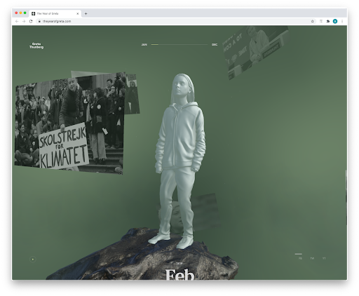
    5. 3D elements

    The Year of Greta website screenshot

    3D elements are becoming increasingly used on websites, whether in the form of rendered illustrations or an actual 3D-like environment. One of my favorite recent sites is the Year of Greta, where the interaction is a virtual experience based around a 3D statue of Greta Thurnberg. As you drag your mouse, the statue rotates and video windows appear that commemorate the 2019 moments of Greta’s fight for climate change. The use of 3D can be gratuitous, but I feel in this case, it was used well, and a fitting testament to a courageous young woman fighting for our environment.

    2020 was a tumultuous year, with disruptions on many fronts. One of the main missions of a designer is to bring visual order to chaos, to facilitate communication, and to create experiences that entertain, educate, and illuminate. All these “trends” reflect advances in technology, stylistic evolutions, and so on, but ultimately, they are a means by which we hope to bring joy to our clients and our audiences. Here’s to a more joyful year ahead!


  • Top 5 Web Design Trends for 2020

    Top 5 Web Design Trends for 2020

    Guest post by Alex Pineda, Matrix Group Creative Director

    New year, new possibilities, especially in web design. With technology advancing at an unprecedented rate, design possibilities seem limitless in the coming year. What do I think we’ll see, design-wise? Here are my predictions for the top 5 web design trends in 2020:

    Progressive Web Applications (PWAs)

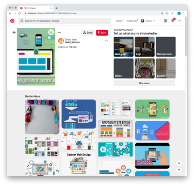
    A progressive web application combines the best of both web and mobile apps – think of it as a website built using web technologies (i.e., HTML, CSS, etc.) but acts and feels like an app.  Since PWAs are a technically a website, there is no need to go through digital distribution systems like the Apple App Store of Google Play, making it simple to deploy and disseminate.

    The major advantages of PWAs are (per Wikipedia):

    • Progressive — Works for every user, regardless of browser choice, using progressive enhancement principles.
    • Responsive — Fits any form factor: desktop, mobile, tablet, or forms yet to emerge.
    • Faster after initial loading – After the initial loading has finished, the same content and page elements do not have to be re-downloaded each time.
      • Ordinary websites often already made use of the browser cache to avoid re-downloading the same data redundantly. But on progressive web applications, the same elements do not need to be re-rendered again.
    • Connectivity independentService workers allow offline uses, or on low quality networks.
    • App-like — Feels like an app to the user with app-style interactions and navigation.
    • Fresh — Always up-to-date due to the service worker update process.

    The term “Progressive Web app” was first coined in 2015, and by 2019, there are an increasing number of companies that use PWAs as the means to distribute their services and content, including Twitter, Pinterest, Trivago, Tinder, etc.  As the barriers to entry decrease for creating PWAs, we can only expect more companies to release their own.

    Design for Accessibility

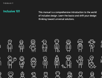
    In the past year, there has been a great deal more care being given to designing experiences that are accessible to as many users as possible.  Microsoft has been a champion of this movement, coining the term “Inclusive Design”, using this definition:

    “Inclusive Design is a methodology, born out of digital environments, that enables and draws on the full range of human diversity. Most importantly, this means including and learning from people with a range of perspectives.”

    To design accessible experiences, keep these things in mind:

    1. Think carefully about your audience – consider who is being included, and who is being excluded.
    2. Ensure your interface provides a comparable experience for all so people can accomplish tasks in a way that suits their needs without undermining the quality of the content.
    3. There are basic principles to follow that enable the best user experiences for the greatest number of people.

    Light vs. Dark Mode

    The ability to switch between dark and light modes has long been available on the MacOS, and with Windows 10, for PC users as well.  I personally tend to use dark mode as it’s easier on the eyes over long periods, and I switch to dark mode on my iPad out of consideration for my sleeping wife.  This ability to switch between modes also applies to your web browser, on Chrome or Safari, and yet this mode didn’t affect the overall style of the actual website.  There is a way on Google Chrome to forcibly turn any website into dark mode, but increasingly, that will no longer be necessary.

    Developers are now working with toolkits and standards, on both Safari and Chrome, that enable your browser to detect which mode (light vs. dark) you are using on your OS, and switch the color scheme on the website to react accordingly.  It will be the responsibility of the website creators to decide if they want to enable this on their site, and how best to adopt a style that works for both. There are a number of guides and tips out there on how design for dark mode, that can help designers and developers take advantage of this new ability, and let users decide for themselves what they prefer.

    Oversized Type & Big Elements

    Websites, particularly for top brands, are favoring large prominent elements – from oversized typography to full screen images, usually a combination of both.  Huge elements like this make a bold brand statement, catch the user’s attention, and help them understand what the site is all about.

    In order to make this approach work, a minimalist approach is necessary.  Reducing the content to a single image (or video) + a short title makes for a clearer message, and an uncluttered experience.  Less is more, but make a big statement!

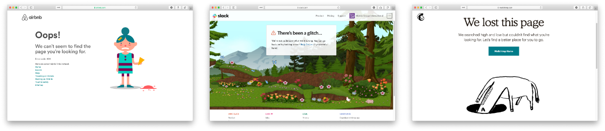
    Illustration as the Brand Personality

    Rather than relying on stock imagery or a generic photo, brands are using tailored illustrations to convey their brand personalities.  My favorite example of the use of these illustrations comes in the form of the 404 Not Found pages such as:

    The key to using illustration successfully relies on their uniqueness and consistency.  If you have the budget, hire an artist whose work you think matches well with your brand vision – dribbble and other artist portfolio sites are a good way to find them.  If you don’t have the time or budget to commission an artist, there are a plethora of vector art libraries on sites like istock or gettyimages, just find collection that has a good number of illustrations to serve your needs.

    Which design trends are you most excited about in 2020? 


  • The Life Changing Magic of Tidying Your Website: Part I

    The Life Changing Magic of Tidying Your Website: Part I

    Last year, my husband and I read Marie Kondo’s “The Life-Changing Magic of Tidying Up: The Japanese Art of Decluttering and Organizing. To say this book was life changing isn’t an exaggeration. Besieged by clutter, we went about decluttering our books, clothes, papers, kitchen accessories, and on and on. We gave away over 1,000 books, I donated 60% of my closet, we shredded mounds of paper, and we can finally see the floor in our garage. Are we done? Absolutely not! But I’m not overwhelmed by the clutter, the master bedroom is a sea of calm, and I love everything in my closet.

    Like closets and homes, websites need regular tidying as well. If you hear this from your members, “I can’t find anything on your website” or “I can’t find what I”m looking for because I get too many search results,” it’s time to tidy.

    Why The Clutter?

    First, let’s examine why our websites have become the equivalent of cluttered homes and self-storage units. This is what I hear from my clients:
    • We need a place to store our archives
    • Someday we might need that study from 25 years ago
    • We don’t know what’s valuable to our members or the public

    What Members Really Want

    And yet, in interview after interview with members, this is what we hear:
    • Just give me the best stuff when I do a search
    • I need my association to curate all the information on “x” topic
    • Tell me what I need to pay attention to
    • The navigation is overwhelming with too many choices
    • I just don’t know where to start looking

    Take the First Step Toward Tidying: What Are People Trying to Do On Your Website?

    This blog post is NOT about the art and science of information architecture. I can go on for day about that. This blog post IS about decluttering. If you want your website to be high performing, ask yourself questions like these:
    • What are people trying to do on my site? If your audience includes researchers who need the historical data, then please include a comprehensive library AND create an effective search. If you want to make the case for membership, chances are you need to do that in six pages or less.
    • Why do we have archives of the conference pages from the last 15 years? If people need the handouts, perhaps you’re better off creating a database of the presentations and creating a great search. If it’s just the staff that find the archive useful, take it offline and make it easily accessible on your local network.
    • Why do we have news and newsletters from the last 25 years? If people need the archives for research purposes, great. If legislative updates from even last year are irrelevant because Congress has a new set of priorities each year, ditch the detailed updated but do keep a list of your legislative priorities and what you’ve done over time.

    Over the past year, Matrix Group has completed about a dozen website redesigns. In almost all cases, the client, after reviewing the content inventory, looking at the analytics and discussing content strategy, ditched more than half of their old content. Tidying made content migration easier and less expensive, the information architecture is more streamlined, and site search is more effective.

    In the next blog post, I’ll talk about love. What’s love got to with your website and clutter? Stay tuned.

  • When Redesigning Your Website, Don’t Confuse Goals with Requirements

    When Redesigning Your Website, Don’t Confuse Goals with Requirements

    I read a lot of RFPs and I attend a lot of website redesign kickoff meetings. The most important questions I ask are, “Why redesign? Why now?”

    I usually get answers like:

    • Our website needs to mobile-friendly
    • The website needs a faceted search
    • Our site search sucks
    • The website isn’t user-friendly

    While these are all perfectly good reasons, I think of these statements as requirements, not goals.

    When Matrix Group is working on a project, we strive to understand the measures of success. If we launch a site that is gorgeous, user-friendly, mobile-friendly and has a great search, will we have been successful? Sure… BUT is the new site generating membership leads, encouraging downloads of research, generating more revenue, raising awareness through better ranking in search, and ultimately bringing in more members and customers?

    Those are the goals we want to ferret out during kickoffs and discovery. How is the new site ultimately supporting the strategic and growth goals of your association?

    In my mind, we won’t know the answer for six to 12 months after launch. That’s scary. It’s so much easier to say the new site is a success because the board loves it and it’s easier to update. But after spending $50,000, $100,000, $150,000 or more and countless staff hours, don’t you want to be able to point to more quantitative results related to your mission and strategic plan?

  • Does Your Website Need a Redesign or Refresh?

    Does Your Website Need a Redesign or Refresh?

    Woman setting before Mac screens, man reaching in front of her to point at something on screenA couple of weeks ago, I attended a meeting with a client who was interested in redesigning their website. “Why?” I asked. The site looks pretty good, the site is mobile-friendly, and the analytics are pretty good. So what’s driving the desire for a redesign?

    The answer: They wanted to make a few changes to the home page, the content throughout the site, and a bunch of the photos. Even though a redesign would have brought Matrix Group a large project, I recommended a website refresh, not a redesign.

    When should a website be redesigned? It’s always going to to depend on the circumstances, but I recommend a full redesign when:

    • The organization is going through a rebranding because of a name change, shift in focus, drastic changes in programs and services or rethinking of its mission and market position.
    • The organization feels that the website no longer represents the organization.
    • The navigation doesn’t have any bearing on what the organization stands for.
    • The design doesn’t reflect who the organization is today.
    • The organization wants to update a large percentage of the content.

    When should a website refresh be done? Again, it’s going to depend, but I recommend a refresh when:

    • The organization is largely the same: same mission, same values, same general program offerings.
    • The website largely works, but it could use some tweaks to the navigation, the images need updating, and the content needs to be refreshed.
    • There are key pieces of the site that don’t work, but they’re not necessarily related to the overall site. For example, many prospects come to us saying that their site search is broken or they need a new member directory or store.

    Sometimes, a client wants to redesign because they hate their CMS and want to move to something different. With a CMS migration, it makes sense not to just to migrate the exact site. Since we’ll be touching every page, it makes sense to ask if it’s also time to rethink navigation, design, integrations and search.

    Matrix Group recently refreshed portions of our website. The analytics on the home page weren’t where we wanted them to be, so we challenged ourselves to update just the home page. It worked. I was also not happy with our Careers landing page. Since we are always looking for the best people, it made sense to redesign just that landing page. During all this, we didn’t do a redesign. We were largely happy with the overall design, navigation, color palette and tone of the content.

    I happen to think it’s important to tweak and refresh your website regularly, at least annually. In fact, some clients do such a good job of evolving their sites that redesigns may be a thing of the past for them.

    What are YOU doing this year? A redesign or a refresh?