Matrix Group International

Tag: Web Design

  • How TheMatrixFiles Blog Became Responsive

    How TheMatrixFiles Blog Became Responsive

    Last week, Matrix Group launched a redesigned version of this blog, TheMatrixFiles.net. Why redesign my blog? I wanted to update the layout and colors, I wanted each post to be more social, and, most importantly, I wanted the site to be responsive.

    Responsive web design is “an approach to web design in which a site is crafted to provide an optimal viewing experience—easy reading and navigation with a minimum of resizing, panning, and scrolling—across a wide range of devices” including widescreen monitors, standard monitors, tablet computers and smartphones.

    Although my team has developed many responsive sites for clients, it’s always interesting and fascinating to implement a new design philosophy for your own firm. Here’s what I learned:

    The widescreen size is the most fun to design for because of all the available real estate. When viewing this blog on a widescreen, high resolution monitor, you get two columns of content in the right rail. At this screen size, the site displays my tags, my recent bookmarks on Delicious, the most popular posts on this blog, etc. I love how the site fills the screen and uses the available real estate.

    Designing for a standard monitor is a lot like designing for a tablet in landscape mode. We collapsed the right rail to a single column and the widgets are set to NOT display content. If you click on the +, the navigation slides down to display the content.

    Designing for a smartphone is the most challenging. You don’t have a lot of real estate, visitors use their fingers to navigate so you need large buttons and touch areas, and the text has to be readable without pinching. We had several lively discussions about what information to display on the smartphone display. We realized by analyzing our Google Analytics reports that people who visit the blog on a smartphone really just want to read the latest blog post. So we wanted to make it super easy to simply read the latest blog post and be done.

    You have to test, test, test your responsive pages. Be prepared to spend countless hours testing and tweaking. For example, you might find subtle differences between brands and models of phones.

    Monitor your usage reports. Currently, about 10% of the traffic on my blog comes from mobile devices. If history serves as a guide, this number will grow quite a bit in the next year for two reasons: mobile traffic is increasing in general but, more importantly, when visitors are rewarded with a mobile-optimized website, they tend to come back on a mobile device. I’ll be sure to report on this in the next few months.

    I’d love to know what you think of the redesigned TheMatrixFiles website. Which device do YOU prefer to use when visiting blogs? Do you feel that we succeeded in creating a mobile-friendly experience with this blog?

  • The iPad Scales Websites So They All Display at the Same Resolution and Look Great

    The iPad Scales Websites So They All Display at the Same Resolution and Look Great

    I love my iPads (I have an iPad1, iPad 2 and my 3 is on the way). I think most iPad owners feel the same way. I’ve owned an iPad for nearly two years but it wasn’t until recently that I realized just why websites look so good on this device. The iPad automatically scales pages up and down so that they display at the full resolution of the iPad. Let me explain.

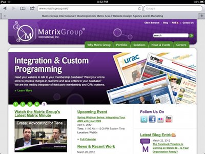
    As Web designers, we’re used to thinking in terms of pixels. At Matrix Group, we normally design sites for a 1024 pixel width resolution. This means that on a 1024 resolution monitor, the website fills the screen. On a widescreen or higher resolution monitor, the website is centered and there is space to the right and left of the page. Check out the Matrix Group website on my widescreen monitor.

    In fact, most websites look like this on my widescreen monitor at home and laptop at work. But on an iPad, most sites look like this:

    This is the Matrix Group home page on an iPad in portrait mode.


    This is the Matrix Group home page on an iPad in landscape mode.

    What I love about scaling is that I’m making the most of the real estate on the tablet and most sites are fairly readable, without a lot of pinching and zooming.  I’m told that there are ways to prevent this automatic scaling on an iPad but I don’t really see why a web designer would do so.

    Next week, after I get a chance to play with my iPad 3, I’ll blog about how the new version supports high resolution images and how we web designers can start creating images that fit the type and resolution of the device. Very cool stuff!


  • Your New Website Isn’t Done, It Probably Needs Tweaking

    My family moved into our new house last July and guess what? We’re not done with the unpacking and decorating. Yes, the new house is worlds better than our old house, all the furniture is in place, we have stuff on the walls, and most of the boxes are gone, but we’re not done and it’s taken months of tweaking to make the house fabulous.

    Our move reminds me of every single website launch at Matrix Group. When a Project Manager reports that he or she will be done with a project when it launches, I warn that there could be weeks of tweaks and that we should just expect it. Here’s why:

    Sometime, you just don’t don’t know where to put something until you’ve lived with it a while. I wish I could say that our information architecture process is perfect and we account for every piece of content, but it’s not and we don’t. Clients often have to live with a site for a few days or weeks before they figure out where everything should go. In the meantime, content doesn’t go up or it gets stored under some generic navigation called Resources. I feel like Resources is like our garage; there’s a lot of great stuff in there but it’s hard to find what you’re looking for and you know you need a better organization system.

    The little tweaks can make all the difference in the world. The new master bathroom in our house is wonderful but it had a few problems. You had to walk inside to reach the light switch and the towel bar was several feet away from the shower. We were unhappy from the beginning but we didn’t know what we wanted or how to fix the problem. Then one day, my husband came home with a wireless outlet that he attached to the wall. Voila! We can now turn on the light before entering the bathroom! And a hook added to the wall just outside the shower solved the towel problem. Same with a website. We often need a few days or weeks of real users road testing the site before we can make the slight improvements to the flows and paths that make the site really great. For one client, we added a Google map link to a calendar application; it was amazing how much happiness 2 lines of code created.

    You can’t finish decorating right away. Our new house is laid out in a very similar manner to the old house but nearly everything had to be re-arranged. Bookshelves got moved around the house, we re-arranged the closets, and the living room is completely different, even though the dimensions are the same and we didn’t buy new furniture. With website redesigns, small changes to the navigation sometimes means a total rework of the content and CMS. And clients often can’t conceive of how to “dress up” pages with images and formatting until they are live.

    You’ll get more done if you throw a party. My mom always says that if you want your house to look good, throw a party. You’ll get the boxes unpacked, the pictures hung and the furniture arranged – just in time. When a client picks the launch date for their website, we ask if they will be unveiling the site at a conference or event. I love having a deadline tied to a conference because conferences don’t move, which means everyone hustle to get things done and it’s amazing how much content gets written right before the event and launch.

    Anticipate the tweaks. At Matrix Group, we know that it takes time for clients to get comfortable with the new site, use its new functions and figure out what’s working and not working. Leslie Blum from Carolinas AGC calls them “iron outs” and she’s right on. It generally takes between 2-4 weeks to get the help text just right, all the new content loaded, and the integration use cases all worked out. So rather than fight the tweaks, we anticipate them and plan for them in our schedule. I will caution, however, that tweaking past 30 days can get counter-productive. You run the risk of the team losing steam and experiencing launch fatigue.

    In the last 30 days, we’ve launched new sites for the Ironworkers, the American Society of Addiction Medicine and the Washington Building Congress. Although the sites look great, we’re still tweaking. 🙂


  • The Ironworker Management Progressive Action Cooperative Trust Website Redesign

    The Ironworker Management Progressive Action Cooperative Trust Website Redesign

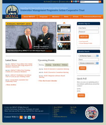
    The Ironworker Management Progressive Action Cooperative Trust (IMPACT), a labor management partnership between signatory contractors and Ironworkers, serves as a forum for both groups to address mutual concerns and encourage balanced solutions. The organization also has 11 regional advisory boards in the United States and Canada that support IMPACT’s mission and work to expand job opportunities in both countries.

    IMPACT wanted to use its website to better promote its resources, events and other services on its website, and encourage members to take advantage of these benefits. It also wanted to enhance its brand and position itself as a leading industry voice.

    Matrix Group:

    • Designed a navigation structure with a strong understanding of members’ needs. The new navigation makes it easy to access information about meetings, publications, grants, marketing and certification.
    • Developed a design that is beautiful, elegant and showcases IMPACT’s values of openness and collaboration.
    • Implemented MatrixMaxx, Matrix Group’s Association Management Software (AMS) to tie IMPACT’s public website to its member database. Now, IMPACT staff can easily manage information about their members, create and manage and meeting registrations and develop targeted mailing lists. Members can now manage their profiles, register for meetings and sign-up for mailing lists.
    • Created an online membership directory that is powered directly by the member database. Visitors can search for contractors, local unions and district councils.
    • Implemented the Expression Engine content management system to make it easy for staff to manage all aspects of the website without having any knowledge of html.

    Visit the Ironworker Management Progressive Action Cooperative Trust Website.

  • The Hormone Foundation Website Redesign

    The Hormone Foundation Website Redesign

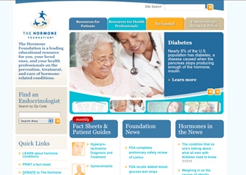
    The Hormone Foundation is the public education affiliate of The Endocrine Society, and the leading educational resource for the public and health care professionals on the prevention, treatment and cure of hormone-related conditions.

    The website offers materials, programs and alerts on everything from thyroid disease to diabetes and cardiovascular and metabolic disorders. So when an opportunity arose to make information online more accessible to all audiences, The Hormone Foundation reached out to web partner, Matrix Group, to make its vision a reality.

    Matrix Group:

    • Re-organized the home page to include a branding area to educate visitors about the mission and activities of The Foundation, and a section that features the most popular resources on the website.
    • Refreshed the site’s current look and feel by softening the organization’s color palette to include warmer colors and updating the font.
    • Implemented the new design in the Foundation’s content management system (CommonSpot).

    Visit The Hormone Foundation Website.

  • The Special Interest Group of IIAS Standards Website Redesign

    The Special Interest Group of IIAS Standards Website Redesign

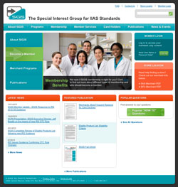
    The primary purpose of the Special Interest Group of IIAS Standards (SIGIS) is to develop voluntary standards to help non-healthcare retailers meet the required IIAS standards and to make it easier for customers to purchase prescriptions and other eligible over the counter products using their Flexible Spending Accounts (FSA) or Health Reimbursement Accounts (HRA).

    SIGIS serves as the industry’s voice to the IRS and as a valuable resource for both members and consumers. Thus, they needed their website to showcase their overall goals and communicate the organization’s current position and address the needs of both members and consumers.

    Matrix Group:

    • Created a warm, friendly site design that communicates SIGIS’s position as an organization that makes it easier for consumers to use their FSA and HSA cards at local pharmacies, supermarkets and other locations.
    •  Implemented the Sitefinity content management system to allow staff to update the website without the knowledge of HTML, keeping the site’s information fresh and up to date.
    • Created a user-friendly navigation based on the motivations, behaviors and needs of SIGIS’s target audiences.

    Visit the SIGIS Website.

  • The Conquer Cancer Foundation Website Redesign

    The Conquer Cancer Foundation Website Redesign

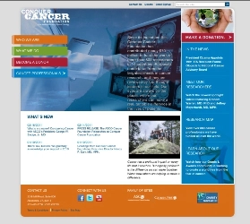
    The Conquer Cancer Foundation (CCF) of the American Society of Clinical Oncology (ASCO), a nonprofit organization dedicated to creating a world free from the fear of cancer by funding breakthrough research, sharing knowledge with physicians and patients worldwide, and supporting initiatives to ensure that all people have access to high-quality cancer care.

    Matrix Group included:

    • Warm colors and images geared toward the public and that demonstrate empowerment. Less text and increased imagery were used to communicate the Foundation’s core messages.
    • A user-friendly navigation that is simple, straightforward and based on the site’s three main areas: who the organization is; what they do; and how to get involved.
    • Brand consistency between the Foundation’s website and its affiliate organization, the American Society of Clinical Oncology (ASCO.org).

    Visit the Conquer Cancer Foundation Website.

  • Does Your Website Need an Attitude?

    Does Your Website Need an Attitude?

    Matrix Group recently had the pleasure of helping the Outdoor Foundation launch a new website for one of its initiatives — Outdoor Nation (ON). Outdoor Nation believes the world would be a better place if we all spent more time outdoors. Outdoor Nation hosts regional summits, connects outdoor enthusiasts through its social network on Ning (the website is on Ning), supports local outdoor clubs, and advocates for local and national outdoor policies.

    Here’s what I absolutely love about the ON website: it’s got a ton of attitude.

    The design of the site is bold, almost brash. But the attitude really shines through in the copy. The about page starts off with:

    Before the recent youth-led revolutions that are now happening around the world—there was Outdoor Nation. Okay, we probably didn’t influence those uprisings but we do share a belief in the power and passion of young people and our ability to start a revolution.

    ON says they “host awesome summits” and “when the ancient Greeks invented social networking, this is what they had in mind!”

    In the branding area on the home page, there’s a big pitch to GTFO (get the f*** outside) because “there’s no excuse not to get the fun outside.”

    How fun to see a website just brimming with enthusiasm and passion! It’s obvious that ON is targeting a specific demographic and not every organization can get away with this type of attitude and language. But I bet more of us could and should inject our marketing campaigns with fresh design and copy that signals a certain lifestyle and brand.

    How about you? What attitude does your website project? Can you name other websites that have a lot of attitude?

  • DecisionPath Consulting Website Redesign

    DecisionPath Consulting Website Redesign

    DecisonPath, a business intelligence consultancy, called on Matrix Group for the redesign of its website, which needed to better communicate the company’s capabilities and experience. More importantly, DecisionPath’s staff wanted the website to serve as the company’s primary marketing vehicle and lead generation tool. SEO and usability were critical components of the website’s design and content.

    Matrix Group:

    • Developed a user-friendly navigation with a clear understanding of user motivations and behaviors.  Matrix Group considered all types of users for this website, from individuals looking for consulting services based on their functionality within their company to more industry focused.
    • Created a clean, updated design that positions DecisionPath as the “agency that can help its clients build its customers’ business by making their businesses’ smarter.  The new website now provides visitors with information on how business intelligence, analytics, and performance management, can be used to help solve companies’ challenges. The website also offers case studies, demonstrating the company’s expertise in utilizing business intelligence into helping clients’ find solutions to their business problems.
    • Implemented a content management system (WordPress) making it easier for DecisionPath’s marketing staff to maintain the website and ensure the information remains up to date (Previously, the entire site was entirely static HTML and required more technical knowledge to update).

    Visit the DecisionPath Consulting Website.

  • International Association of Chiefs of Police Website Launch

    International Association of Chiefs of Police Website Launch

    Matrix Group  has been a long time partner of the world’s oldest and largest nonprofit membership organization of police leaders, the International Association of Chiefs of Police (IACP) who decided to launch an online clearinghouse of information and free resources to help members develop or enhance their agencies’ use of social media and integrate the tools into their daily operations. To create this online resource center, IACP turned to Matrix Group. Matrix Group collaborated with IACP staff on a new website, using the agency’s user-focused methodology to develop and implement the strategy around the website.

    Matrix Group:

    • Developed a user-friendly navigation with a clear understanding of the users’ motivations and behaviors.  Matrix Group considered all types of users for this website, from beginners to more experienced users. The topic-based navigation directs visitors clearly to specific areas of the website based on their needs.
    • Created and integrated an online directory of law enforcement agencies that use social media, including the URLs of agencies’ social media pages and blogs.  This directory not only showcases the work that the various agencies are doing, but it also helps members develop their own social networking strategies, policies, etc. Members can now browse or search the directory, and view other agencies Facebook pages, Twitter profiles, blogs, etc.
    • Created a catalog of resources, templates, case studies related to law enforcement use of social media. The new website is a “one stop shop” where chiefs and officers can find examples of social networking policies and strategies, download guides and fact sheets on how to create profiles on social networking sites, and read case studies about how other agencies are including social networking in their work.

    View the International Association of Chiefs of Police – Social Media Website.