Matrix Group International

Category: Design and Information Architecture

  • Why Your Organization Needs a Mobile Strategy

    Why Your Organization Needs a Mobile Strategy

    Woman on a mobile phoneDuring a meeting with other CEOs last month, I noticed that nobody pulled out their laptops; instead, every person with a device was using an iPad. At least two of my clients have said they’ve turned in their laptops in favor of tablets. And a mom friend says she manages her entire household with her blackberry.

    In case you hadn’t noticed, the world is going mobile. Check out these amazing statistics:

    Which is why I think every organization needs a mobile strategy. Here are my top recommendations for getting started:

    Include Mobile in All Of Your Marketing and IT Activities

    Over a dozen years ago, I urged clients to be the person in the room who always said, “what about the Web?” Today, appoint yourself as the person who says, “what about mobile?” Know what tools you have available in your mobile toolbox, including mobile stylesheets, mobile sites, text messaging, and apps. Talk to your customers and ask them if, how and when they access your website and e-mails on a mobile device.

    Budget for Mobile Initiatives

    I believe mobile needs its own line item in your budget or it needs to added to your marketing and IT activities. For example, do you have the hardware you need to view your website on an iPad, Android phone, iPhone, iPad or Android tablet? Be sure to ask your Web partner (like Matrix Group!) to help you budget for mobile, whether it’s developing an app for your convention, designing a mobile version of your website, or using text messages to generate traffic at your exhibit hall.

    Planning a Website Redesign? Plan for a Responsive Design!

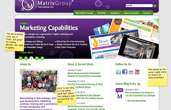
    Here at Matrix Group, we’re really excited about building websites that look and behave differently depending on the size, platform and orientation of the device, including widescreen monitors, standard size monitors, tablets and smartphones. Responsive Web design uses a mix of flexible grids and layouts, images and javascript to customize the experience for the device. For example, if I’m looking at a website on a smartphone, the large branding area could disappear and the horizontal navigation might turn into vertical text navigation. If your organization is thinking of redesigning your website, please consider a responsive design. You will spend more time and money on wireframes and design, but the results will be worth it. Just imagine: less pinching and squinting for smartphone users and lots of gestures and swipes on tablets.

    Pay Attention To Your Mobile Stats

    As always, pay attention to your usage reports. Google Analytics has a whole, new set of reports that tell you what your mobile users are doing and what devices they are on. I’m using our usage reports to figure out what functions to include in a new mobile version of our MatrixMaxx software since we don’t believe mobile users want to use ALL database function.

    How about you? What’s your organization’s mobile strategy? How are you getting started? What kind of results are you seeing?

  • Why a Redesign is Like Moving: Time to Audit Your Stuff and Toss, Toss, Toss

    Why a Redesign is Like Moving: Time to Audit Your Stuff and Toss, Toss, Toss

    My husband and I recently bought a new house. Even though the new place is slightly bigger than our old house, I was determined not to move old crap so I took the time to audit all of our stuff and toss out as much stuff as possible. During this process, which took months, I realized that moving to a new house is a lot like redesigning your website. Here’s how:

    Inventory and audit everything. During the move, I was amazed at the stuff that I “found” and the junk that I ended up tossing. It makes me think of a content audit we completed for a client recently. After delivering the Excel spreadsheet that listed all of their website’s content, the client said, “wow, there’s so much stuff that we didn’t realize we still had online.”

    Don’t just hire movers to move everything. A neighbor recently moved and she hired movers to pack up her entire house and move the boxes and furniture. Me, I prefer to do my own packing because it gives me a chance to edit, sort, and toss. With a redesign, I recommend that clients not ask us to just migrate everything because inevitably, we’ll migrate content that should be archived or we’ll put content into the wrong place and it gets “lost” forever.

    Use a move to re-organize the flow of your house or website. When Maki and I moved into our old house, the garage was pristine. Over time, the garage became a dumping ground for everything: old notes, out of season equipment, holiday decorations, overflow storage for kitchen items, yada, yada. Pretty soon, the garage was a mess and it was hard to find anything. With this move, I’m taking the opportunity to re-organize the garage so that everything has its place, the shelves are properly labeled, and like items are grouped together for easy access. Same with a redesign: don’t just dress up the pages, use the redesign as an opportunity to make it easier for your customers to find information and services. And label everything properly!

    If you haven’t used it in a year, toss! My mom always tell me to toss clothes that I haven’t used in a year. While this advice is not always practical (think winter coats and specialty items), I think it makes sense to put into storage, donate or toss things that my family no longer needs. Same with your website. Check your usage reports to see what content is just not getting visited. If the content is no longer relevant or out of date, you’re better off archiving the content offline or simply deleting it. In fact, old content can be a bad thing because Google can index it and serve it up to visitors, which can cause confusion and misinformation.

    Organizing takes time. This process has taken more time and energy than I had originally budgeted. So the moral of the story is to allocate enough time to do your content review, then double or triple your estimate.

    Get professional help. I’ve blogged in the past about how I worked with a professional organizer to get my house into shape. For the new house, I’m involving C. Lee from SimplifyYou early. She is going to help me figure out where to put mail, how to store kids’ games for easy access, how to organize supplies in the garage, etc. She can tell me what other clients have done and she can recommend products and solutions that would take me hours to research. With a website redesign, I recommend that clients work with us to create the content inventory, site map, migration plan, navigation and taxonomy. We’re able to do the work faster and we can draw on our experiences working with hundreds of other organizations.

    Don’t just make the new house a replica of the old house. Sometimes, clients ask us to redesign their websites, but they want the navigation, content and applications to look and work exactly the same way. What is the point then of the redesign? A new website, like a new house, will have similar functions (think kitchen, living room, dining room, etc. or About Us, Contact Us, Calendar, etc.) but the new site should have updated and improved design, flow, content and functions. Now is the time to create a really great About Us page, redo the site search, roll out some new publications and rethink the online store.

    The new house is a work in progress and it will take time to get it just right and feeling like home. But the time, money and effort will be more than worth it.

    How about you? When was the last time you moved and how did it go? Is it time to “move” or redesign your website to clear out the garbage and create a fabulous, new space?

  • Does Your Website Need an Attitude?

    Does Your Website Need an Attitude?

    Matrix Group recently had the pleasure of helping the Outdoor Foundation launch a new website for one of its initiatives — Outdoor Nation (ON). Outdoor Nation believes the world would be a better place if we all spent more time outdoors. Outdoor Nation hosts regional summits, connects outdoor enthusiasts through its social network on Ning (the website is on Ning), supports local outdoor clubs, and advocates for local and national outdoor policies.

    Here’s what I absolutely love about the ON website: it’s got a ton of attitude.

    The design of the site is bold, almost brash. But the attitude really shines through in the copy. The about page starts off with:

    Before the recent youth-led revolutions that are now happening around the world—there was Outdoor Nation. Okay, we probably didn’t influence those uprisings but we do share a belief in the power and passion of young people and our ability to start a revolution.

    ON says they “host awesome summits” and “when the ancient Greeks invented social networking, this is what they had in mind!”

    In the branding area on the home page, there’s a big pitch to GTFO (get the f*** outside) because “there’s no excuse not to get the fun outside.”

    How fun to see a website just brimming with enthusiasm and passion! It’s obvious that ON is targeting a specific demographic and not every organization can get away with this type of attitude and language. But I bet more of us could and should inject our marketing campaigns with fresh design and copy that signals a certain lifestyle and brand.

    How about you? What attitude does your website project? Can you name other websites that have a lot of attitude?

  • Examples of Really Great Donation Pages

    Examples of Really Great Donation Pages

    mouse connected to a tin canEvery December, my husband Maki and I sit down and make decisions about our charitable giving. Once we’ve decided on the organizations and amounts, we go online and get everything done. What I’ve noticed is that most organizations have less than optimal donate pages or sections of their website. Here’s what I want from a Donate page:

    • Why I should give
    • What my money supports
    • An easy way to make a donation, preferably without having to create a login
    • If using a third party payment gateway or network, make it really clear to me what I’m going to see on my credit card statement
    • A statement that you won’t rent or sell my information to other charities

    Instead, what I usually find is a simple e-commerce form that simply asks me for my credit card information! What a waste of an opportunity to make the case for giving!

    So I scoured the Web and looked for effective donation pages. Here are some I love:

    Johns Hopkins Giving – This is a microsite devoted entirely to giving. I like the navigation: Why Give, Where to Give, How to Give, Calendar. I also like the branding area, which has great stories about Hopkins students and professors and doesn’t rotate too quickly.

    Humane Society – I like how the donation process starts on the home page through a simple form, then continues to a larger form. I think it’s effective to call donors heroes who stand up for animal rights.

    Meals on Wheels America – Without support from programs like Meals on Wheels, millions of seniors are forced to prematurely trade their homes for nursing facilities.

    Wounded Warrior Project – When you give to the WWP, you’re supporting an organization whose broad appeal reaches across demographic, geographic, and political boundaries. For us, it’s not about the war; it’s about the warrior.

    How about you? What are your favorite donation pages? Got any examples of donation page disasters?

  • You Don’t Need a Full Redesign to Improve Your Website

    You Don’t Need a Full Redesign to Improve Your Website

    A couple of weeks ago, we unveiled a new home page for the Matrix Group website. We didn’t change the overall navigation and we didn’t create a new look and feel for the site. All we did was revamp the branding area and re-arrange elements on the home page. Small changes, big impact.

    Most organizations go years between redesigns. It’s a big deal to redesign a website; it takes a boatload of time, effort and money. But in between redesigns, most organizations become unhappy with their sites. We have clients come to us because they’re unhappy with everything on their site, which was last redesigned 3, 4, or 5 years ago. Does it have to be this way? I think not.

    There are many, many reasons to redesign your website, including:

    • Your organization’s mission, name, logo and/or brand have changed dramatically.
    • Visitors complain about not being able to find what they’re looking for.
    • Your products and services have changed or you’ve added new offerings and you don’t know where to put all the information.
    • You are rethinking how your website fits into your company’s overall marketing strategy and want to redo all or nearly all of the content.

    BUT, if you’re largely happy with the design and navigation of your site, visitors are able to find what they’re looking for, and your company branding and messaging remain the same, perhaps all you need is a website refresh. Here are some ways in which clients have refreshed their sites:

    • One client changed the headers graphics throughout the site and added social media widgets.
    • Another client made the entire website wider (the site had been designed for 800 x 600 pixels) and added another column on the home page for events and a featured publication.
    • Yet another client revamped important landing pages and improved pages by editing the text and adding images and formatting.

    If you don’t have the budget for a full redesign this year, opt for a refresh and focus on content and making calls to action more prominent.

    BTW, here’s a photo of the new Matrix group home page and reasons for the refresh. I’d love to know what you think.

    How about you? What’s in store for your site in 2011? Full site redesign or refresh?

  • Why Organizing Your House is a Lot Like Organizing Your Website

    Why Organizing Your House is a Lot Like Organizing Your Website

    Last summer, a few months before the birth of my second son, I realized that I had to do something about my house. The house felt overrun with kids’ toys, there was mail everywhere, and I couldn’t find things. At the suggestion of several mom friends, I hired a professional organizer. C. Lee Cawley of SimplifyYou came to my house, spent 3 hours with me on two occasions and changed my life. I learned that organizing your house is a lot like organizing your website. Here’s how:

    Sometimes, you need a professional to do the work or help you out. Of course I could have tackled the job of organizing my house myself, but I had been trying to get my house in shape on my own without much success.  C. Lee didn’t just get the project jump started, she gave me a framework to work with.  Organizing a website is no different.  You can do the work yourself, but a good website Information Architect (IA) will help you understand user flows, and get you fired up when the task or re-organizing your website has stalled.

    A good organizer gets to you know YOU. Before making recommendations, C. Lee walked the entire house with me, asked a ton of questions, and got to know me, my family, the rhythm of our life, and our priorities.  For example, C. Lee came to respect and understand that my photos, my son’s artwork, and art from our travels are some of the  most important things in my house. So she made recommendations for storing and showcasing them, rather than trying to convince me that I don’t need to keep CJ’s masterpieces from preschool.  A good IA figures out what makes each client unique, who their audiences are, their most valuable services, and their goals for a redesign.  He or she will geek out on your site’s usage reports, interview staff and outside stakeholders, create a content inventory, get a handle on all content, and strive to understand how visitors should navigate your site, for maximum impact, traffic and conversions.

    Who is going to use this? C. Lee and I came up with a plan for organizing the house that worked for me, my husband and my son. For example, we created an area in the coat closet for my son that has low hooks so he can put away his backpack and coat himself. On your website, be sure to take into account your target audiences, their demographics and psychographics, what they are looking for, what they call things, and the transactions they want to make. For example, avoid insider terminology if you have a general audience and add a prominent way to resize text if you are targeting a senior audience.

    A good organizer has a repertoire of tools. When it came time to find a home for all the “stuff” in my life, C. Lee gave me a multitude of options so I could select solutions that fit my budget and design aesthetic. She suggested different ways to store all of my shoes (Hey, I’m Filipino, after all!) and CJ’s trains and Legos. A good IA will explore different ways to organize your content (by topic, function or audience, for example), and present options for navigation and featured content.

    Everything needs a home. C. Lee says that clutter happens when you don’t have a permanent home for everything. So mail piles up on your dining room table, kids’ games get stacked in a corner, and small electronics end up everywhere. But if everything has a home and you make a commitment to putting it back after use, clutter is less likely to happen. So too with a website. We can take the latest news item, recent publications, and the membership application form and feature them on the home page , the footer or the right rail, but we need to know where they live permanently so they can be found from anywhere in the site, not just specific pages.

    Do you really need all that stuff? When I finally went through the mounds of toys in my living room, I found toys that my son never played with or hated, broken items, and games he had outgrown. Good grief! Why was  I holding on to this stuff? The short answer is I hadn’t taken the time to review, weed, edit.  When you create a content inventory of your entire site, you might be surprised at what you find. Ask yourself which content is old and dusty and needs to be archived, which content should be updated, and which content is compelling and necessary. And you should schedule a time (I recommend twice a year) to go through content on the site and determine what stays and what goes.

    How about you? What have you organized lately and did anyone help you along the way?

  • A Great Web Site, Like a Great Event, is a Collaboration Between Client and Vendor

    A Great Web Site, Like a Great Event, is a Collaboration Between Client and Vendor

    Matrix Group Open HouseLast night, Matrix Group hosted an Open House to welcome clients, partners, vendors and friends to our new office in Crystal City (okay, new as of August last year).  We used the occasion to finish decorating the office and brought in Design Cuisine (Design), a leading catering company in the DC area, to orchestrate the event.

    The Open House was wonderful!  The office looked great, the food and drink were outstanding (loved the beef satay and blueberry mojitos!), turnout was great, and by all accounts, guests enjoyed themselves thoroughly.  The Open House made me realize that hosting an event, much like putting up a Web site, should be a collaboration between client and vendor.  When both parties do their part, the result is almost always success. Here’s what I’ve learned:

    • Clients should take the lead when it comes to goals and direction. When Matrix Group is designing a Web site, we ask lots of questions and try to find out what their goals are and what a successful project looks like.  In the same way, Seana Hale from Design Cuisine wanted to know all about Matrix Group, how we interact with clients, and how the Open House would support our client and partner relationships.
    • Clients should define the overall design aesthetic and values. When Matrix Group designers are working on a design project, we don’t try to change the character and image of an organization.  Instead, we strive to understand the client’s brand, represent it well via design and multimedia and enhance it through our work.  Design Cuisine understood that we wanted a nice event that showed off our creativity and our work, was modestly priced, and played up our brand color of purple without overdoing it.
    • Let the experts take the lead but be prepared to give timely feedback.  Once we’re armed with good background information, our UX (user experience team) creates navigation, wireframes and designs.  It’s great when the client trusts our judgment, takes design direction AND lets us know if we’re on the wrong track by giving us specific and timely feedback.  We also love it when clients let us brainstorm and come up with out of the box ideas, knowing that most won’t fly but the creativity that comes out is good for the project.

    (more…)

  • Dear Restaurant Owner, Please Ditch the All-Flash Web Site

    Why do restaurant owners love Flash so much that their entire Web sites are in Flash? Don’t get me wrong, I love Flash and I make a living selling Flash movies, branding areas, yada, yada. But most Web sites should not be all Flash!

    Here’s an example of an all Flash site that is annoying and borderline useless. I was scheduling lunch with a friend, who asked me to recommend a restaurant and send him the physical and Web addresses. No problem, right? Wrong.

    Check out the Web site for Kora in Crystal City – http://www.korarestaurant.com/ The Web site is pretty, but if you’re trying to get an address and send it to a friend, it’s not user-friendly at all!

    • It took me 5 minutes to find the address.  It’s not on the home page, nor under Hours and Directions.  It’s under Contact Us and Reservations.
    • Because the site is entirely in Flash, I couldn’t copy the address and paste into the e-mail I was sending my friend.
    • I also could not copy and paste the address into Google maps so that I could send my friend directions from Reston.
    • Forget being able to bookmark specific pages because the URL never changes in the single Flash file for the entire site. So I couldn’t send my friend the URL of a menu page.  Aaaargh.
    • Oh yeah, you can’t print Flash pages either unless print-friendly pages have been specifically created; most designers don’t bother.  So if you want to print Kora’s Hours and Directions page, you’re out of luck.

    Since I’m lazy and did not want to re-type the address, I simply went to Google, typed “Kora Arlington, VA” and got a link to a map and directions from Google maps.  God bless Google.

    I’m sure Kora paid good money for its beautiful, all Flash site, but I bet it’s a pain to update and it’s not very accommodating for visitors who just want to copy and paste an address.  Good grief!

    How about you?  Got your own rants against an all Flash site?  Post links and comments!

  • Are Home Pages Dead? Where Are Your Visitors Going?

    Are Home Pages Dead? Where Are Your Visitors Going?

    My mom called me up one day to tell me that she loved the Google logo that day and what did I think of it? (I think the Google logo was commemorating the 40th anniversary of Sesame Street that day, btw.) At that moment, I realized that it had been weeks, maybe months, since I last visited the Google home page. Of course I use Google every day, but I use the Google search that’s built into my Web browser. Whenever I need to do a search, I click into the little box, type my keywords, then hit Enter. And voila, I get my search results.

    I got to wondering if the home page, the single that we, as Web designers, spend soooooo much time wire framing and designing, has lost its luster. So I started checking our usage reports.  Sure enough, the home page of this blog gets represents between 7-10% % of the total traffic in any given month and 6-9% of total entry pages.  It makes sense given that most of the traffic comes from the blog’s RSS feed, e-mail updates, social media pages and search engines, all of which direct visitors to specific pages,  NOT the home page. The Matrix Group Web site home page gets 28% of total traffic, and that number makes sense, given that many people come to the site to learn more about the company as a result of our direct marketing efforts.

    I started checking clients’ usage reports and I found that of all the sites I checked, the results were similar.  The home page gets between 17-40% of total traffic, and 15-30% of entry pages.

    It turns out that lots of other people are thinking about this phenomenon and some are even declaring that the home page is dead.  Rick Stratton from Feed.us says, “(y)our homepage’s homepage is dying” because search engines, social media, RSS are linking directly to content pages.
    (more…)

  • Top Tips for Customizing Your Twitter Profile

    Top Tips for Customizing Your Twitter Profile

    Twitter logoI’m following over 700 people on Twitter so I’ve looked at a lot of Twitter pages.  Yes, I look at pages and tweets closely before making a decision to follow someone.  Some profiles are pretty sparse, while others are fairly elaborate.  What’s the saying? “You only have a few seconds to make a first impression.”   This is especially true on Twitter where people scan your page, then instantly make the decision to follow or not follow.

    So how do you customize your Twitter profile page to maximize followers? Here are my top tips:

    • Make sure you fill out your name so it’s searchable. This sounds so simple, but consider this:  The Humane Society of the United States is @humanesociety, but the profile name is listed as HSUS.  If you use the Find People search on Twitter and type Humane Society, the HSUS page does not come up because the Twitter search only searches the Name field, NOT the username.  A better name would have been Humane Society of the US.
    • Fill out the Bio and Web site fields. This is a perfect opportunity to link your Twitter page to your company Web site or blog AND provide a short elevator speech.  The bio and URL add perspective and credibility.  You can be formal, you can be clever, or you can be funny in the bio field.  Check out other bios for good ideas.  I like @pmohara and @neagle.  In addition, I hear from many, many people that if someone has not provided a bio or URL, they are much less likely to follow that person. (more…)