Matrix Group International

Category: Design and Information Architecture

  • Set 2023 Up for Success: 7 Easy Upgrades to Make

    Set 2023 Up for Success: 7 Easy Upgrades to Make

    Looking for a few easy upgrades that are light on the budget but will start you off strong in 2023? Matrix Group Creative Director Alex Pineda and Lead Front-End Developer Jaime Quiroz have suggestions for a few simple upgrades and updates you can make that will improve your user experience, give you more accurate data, and help you better serve your members.

    1. Pick one template that you use often, and update it

    We live in an era where new and fresh is not just preferred but expected. Keep your brand and assets fresh by auditing and updating one or more of your most-used templates. This could be a template for your: newsletter, PowerPoint presentations, meeting pages, PDFs, press releases, or social media posts. Little tweaks like this can make a big difference, and good designers should be able to do this work fairly quickly. 

    2. Refresh the most visited page on your website. 

    Google loves it when you update your pages, and your users do, too! Take a look at your most visited page, and ask yourself: 

    • What images could we replace to make this page more high-impact? 
    • What can we reduce to increase clarity on this page? 
    • Is the page too cluttered; what can we do to make it simpler? 
    • What is the goal of the page? Is there a clear flow to the call-to-action to meet that goal?
    • Why is this page so popular? What other content can we feature that is connected to the popularity of this page?
    • Is there any industry jargon on the page that needs to be reworded? 

    Even updating two or three little things can make a big impact! 

    Not sure which page is your most-visited page? Take a look at your analytics. If you’re not sure how to do that and need help, maybe now is also a good time to invest in some Analytics training. Speaking of Analytics…. 

    3. Upgrade to Google Analytics 4 

    Google Analytics logo on laptop screen

    If you haven’t upgraded to Google Analytics 4 (GA4), you need to upgrade as soon as possible! Google is sunsetting Universal Analytics on July 1, 2023. Due to the new data model in GA4, you won’t be able to move your data from UA to GA4 and data between UA and GA4 won’t be comparable. You need to start collecting your data in GA4 yesterday to have the comparative reports you’ll need next year. (Psst, if you need help getting GA4 installed on your site or want training on the new interface, we can help!)

    If you already have GA4 installed on your site (bravo!) we recommend investing in one Google Data Studio custom report. Google Data Studio lets you create beautiful dashboard reports that aggregate data and reports so you can see and understand your data more clearly. 

    4. Update link text and button text on your website to improve accessibility and usability. 

    It’s important to make your link text and button text as descriptive as possible on your website. This is important for usability, but even more important for accessibility. People who use screen readers (e.g., people who are blind or low vision) need descriptive links or button text so that they know how to execute an action. For example, a link that says Click here is not useful to screen readers; “Register now” or “Read our annual report” is more helpful. 

    The icing on the cake: this practice is also great for search engine optimization. When you link the whole phrase, your sites gives Google and other search engines better clues about what your content, page, and links are about; this can help boost your authority and ranking. 

    5. Take your most important PDF and turn it into an HTML page.

    Why? For so many reasons. Search engines can’t tell from a PDF what your content is really all about because all of the text is treated equally; PDF pages are lacking H tags that provide a hierarchy for what the page is all about. In addition, PDFs are not good for accessibility, they’re not mobile friendly, and they’re not easy to update. Yes, you have more design control with a PDF, but you need to consider all of the other factors at play. Converting your most important PDFs to HTML pages will drastically improve usability, accessibility, and SEO.

     If you can’t do away with the PDF completely, a great option is to convert what you can to an HTML page, and still make the PDF version available. A great example of this is ERISA Industry Committee’s Policy Priorities document that they turned into a web page, while still making the PDF available. See ERIC’s Policy Priorities web page here

    6. Increase security by using and requiring 2-factor authentication

    If you haven’t already, we beg of you: install 2-factor authentication for EVERYTHING that you can, and update your security policy to require it. Yes, it can create a minor inconvenience – maybe add 15 seconds to a log-in process – but those few seconds might be the very thing that saves your organization from being completely compromised, which would cost you a lot more time. 

    7. Improve your search by adding 10 more best bets

    For your top 10 most searched queries on your site, are your users getting to where they need to go? One way to make sure they get where they want to go, or where you want them to go, is to update your best bets to serve better results. Best bets, or featured results, tell your search engine that for specific keywords or phrases, you want X and Y pages to be at the top. For example, if someone types the word “awards” into your site search, they might get a jillion results, but what they probably want is your awards landing page, so set up a best bet for the awards landing page. Start by looking at your search analytics, determining the top 10-15 searched words or phrases, and adding best bets for those words and phrases. This is a quick and easy thing to do, but has the potential to drastically improve your users’ experience with your site. 

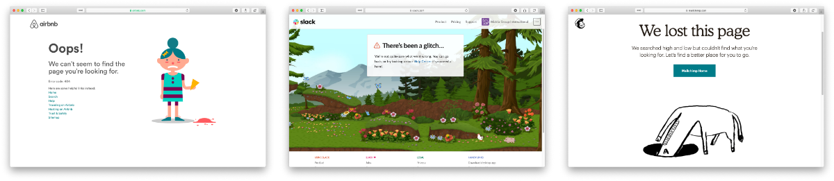
    BONUS: Update your 404 page

    Your 404 page is a great place to have a little fun on your website, and provides a low-stakes opportunity to show a little personality and reinforce your branding in a new and different way. For example, FMI – The Food Industry Association’s 404 page says “Clean up on Aisle 4!” something often said in their grocery store members’ day-to-day. At Matrix Group we’re big Star Wars fans, so check this out: https://matrixgroup-wp-new.matrixdev.net/whoops 

    If you have some extra budget left to spend in 2022 or are looking for quick wins for the start of 2023, we hope these suggestions help! If you want to dive deeper into any of these ideas, you can watch the recording of the webinar we held last week on this topic or reach out to our team, who would be happy to continue the conversation. 

    Remember, little things add up and can make a big impact! 

    What projects are you planning to tackle in 2023, big or small?

  • What Have We Learned About Creating Engaging Meetings from Virtual Conferences?

    What Have We Learned About Creating Engaging Meetings from Virtual Conferences?

    Virtual Meeting vs. In-Person MeetingHeinan Landa (CEO of Optimal Networks) asked me last week: As we’re slowly returning to the office and in-person meetings, what lessons from 15 months of virtual meetings should endure?

    It’s a great question. Over the past year, I’ve had many clients bemoan virtual, but I’ve also had many clients express joy over the benefits of virtual. Here are lessons that I hope will endure:

    Higher Quality Sessions

    It sounds really weird to say this because organizations that put on conferences are devoted to offering high quality education. And yet, a few clients were surprised at how lackluster some of their sessions were. I heard things like, “Gosh, we used to select speakers, tell them when and where to show up, make sure their tech was working, and leave the room.” But with virtual, more thought has gone into the quality of the sessions to make sure people stay engaged and don’t log off. BeSpeake clients have:

    • Paid closer attention to the content and slides.
    • Worked with their speakers to add interactive elements, from polls to contests.
    • Coached speakers to become better presenters.

    ALL of these lessons should endure past this pandemic!

    Better Wayfinding

    I’ve been to countless conferences at the Gaylord Resort in Maryland and every time, I get lost. Maybe I’m just navigationally challenged but better signage and more thoughtful grouping of the sessions and events would help me, and, I suspect, many others. With virtual, we worked closely with clients to make sure attendees always knew where to go next, using tools like:

    • Welcome and tutorial videos that explain the virtual platform and highlight the “not to be missed” parts of the meeting.
    • Putting everything on the program and having sessions disappear (temporarily) from the schedule once they are done. This way, the program always shows you what’s next.
    • Brief but clear descriptions and help text.
    • Guidance from speakers at the start and close of sessions about what’s next.
    • User testing to make sure all of this wayfinding guidance is actually effective.

    The next time you’re in person, walk your convention, make sure signage is clear, and coach speakers to tell attendees what’s next!

    Intentional Connections and Networking

    Conferences are all about connecting with our friends, colleagues and peers. In person, most conference planners organize receptions, some breakouts, and food and drink in the exhibit hall. Virtually, meeting planners have had to work harder to make sure attendees connect with others. We’ve worked with our BeSpeake clients to create opportunities like:

    • Morning Coffee, where attendees get matched up with others randomly for a virtual coffee break.
    • Extended attendee profiles and better searching.
    • Easy to use attendee search and messaging.
    • Giving attendees the chance to meet with others in video rooms.
    • Breakouts by topic or job function to encourage people to be on video and connect with others.

    These virtual connection opportunities don’t work for all attendees. Some attendees are content to focus on the sessions. But for others, these connection opportunities have made it easier than ever to expand their networks and horizons.

    In person, perhaps you can make in person conferences less terrifying for first time attendees by doing things like:

    • Asking Board and committee members to reach out, walk them through the program, attend a social event with them, and introduce them to a couple of members.
    • Creating a welcome or tutorial video to help attendees get the most out of the conference.

    Delightful Touches

    We’ve worked hard with our clients to make their meetings interesting and delightful. Some things that have worked are:

    • Interesting, even fun, pre-roll before sessions. At first, we added pre-roll so attendees would have something interesting to watch when they came in early to sessions. Then we realized pre-roll was a great way to entertain and educate!
    • Interesting imagery to evoke a place or theme.
    • Polls and contests to add sparkle to a session or break. One client is now known for a great Jeopardy game where the questions are all about their accreditation program!
    • One client had a virtual bulletin board where they challenged attendees to share what attendees and their organizations are doing to address racism and health inequities.

    In person, ask your speakers to show pre-roll, play music, and start the conversation early. Have places where people can post, share and connect, not just virtually, but also in person!

    As my friend Lee Gimpel says, in person meetings aren’t necessarily great: it’s hard to meet people if you’re new, the program can be confusing, and we spend way too much in dark rooms looking at screens and passively watching a speaker. 

    What have YOU and YOUR ORGANIZATION learned about creating engaging and fun meetings during this pandemic? What lessons will carry over and endure when you go back to in person meetings?


  • Why Journey Mapping is so Important to Creating Amazing Member Journeys

    Why Journey Mapping is so Important to Creating Amazing Member Journeys

    Member Journeys

    Matrix Group is working on an email signup project for a longtime client. This client wants to create an easier way for members and non-members to see all the newsletters the association has to offer, and easily subscribe to receive them. Some newsletters are open to the public, while others are members-only. The client has many goals with this project:

    • Showcase all of their newsletters
    • Get more people signed up
    • Make it easier to sign up

    Seems simple, right? Not so fast. In fact, it’s taken us a few weeks and multiple rounds of wireframes to get what I think will be a winning sign up form. The form itself will look simple BUT it will ultimately be the result of intentional journey mapping to ensure that the sign-up process is simple and amazing.

    How do we do it? First, we identify the audiences and the tasks they wish to accomplish. Then we map out the journeys they need to take to get what they want. We ask questions like: Will the person need to log in? What if they don’t already have a username? What if they forgot their password? How will they know that they are not eligible to subscribe to specific newsletters?

    Here’s a simple sign-up journey: Member is already logged in, goes to the sign-up form, presses the Subscribe button next to the newsletters of her choice, and gets a thank you pop-up.

    Here’s a not so simple sign-up journey. This journey took some time to articulate and make easy: Individual is with a member company but doesn’t already have a password. Individual navigates to the sign-up page, presses Subscribe. User is taken to a login page. She doesn’t have a login, so she has to create a profile and attach herself to the proper company. The profile form is two pages. At the end, she can navigate back to the sign-up form; this is important because some systems dump users back to the home page after creating a profile, which is disorienting to users. The form remembers which newsletter she wanted to sign-up for and she gets a success message.

    You see, it’s not enough to create a form and say it works. You need to map all of your user journeys. If your users have to log in, create a profile, or traverse websites, their journey is going to be more complicated, so you have to be intentional about it, know how many steps the journey is going to take, and involve your vendors in making the journey great, even if that journey requires multiple steps.

    If you’re not already doing this kind of journey mapping with all of your projects, start now. You don’t need special software to do it, but you do need time to explore the journeys. Need help? Give us a call. We love this process and we’re great at asking the questions that will lead to amazing member journeys.


  • Top 5 Web Design Trends for 2021

    Top 5 Web Design Trends for 2021

    It’s safe to say that, thanks to the pandemic, our lives are lived online now more than ever before. The more time we spend in the digital world, the more the lines are seeming to blur between physical and virtual, lending way to some exciting new web design trends. Here are the 5 trends that I think will be most popular in 2021:

    1. Neumorphism


    Neumorphism example
    Twitter header of Marques Brownlee

    The death of “skeumorphism”, or the digital equivalent of “real-world” surfaces and objects, gave rise to “flat” design that has dominated UI design for a few years now, famously championed by Jony Ives, former design director of Apple. The inevitable backlash to flat design is a trend back towards more “realistic” interfaces, but far short of full skeumorphism. This “neumorphic” trend features elements that rise subtly from the background, (e.g., gentle shadows), and are far more subdued than pure skeumorphic digital objects. While more prevalent in app design, these neumorphic elements are popular on the web as well.

    2. More lives lived online, more integrated experiences


    virtual event features

    2020 saw us working remotely, avoiding close contact with other humans, and sheltering in our homes. The COVID crisis has had an enormous impact on our daily lives, and how we do business. Matrix Group is, of course, no exception – we’ve had to change our way of interacting with our teams, serve our clients, and craft interactive experiences. For our association and non-profit clients, one of the biggest challenges was how to hold conferences and annual events in the year of COVID and non-gatherings. To address this challenge, we at Matrix Group created a virtual event platform called BeSpeake, with the goal of having virtual meetings that are more than just a bunch of video conference windows, but a space to still have meaningful interactions with members, vendors, and sponsors. This trend of integrating live video, multimedia presentations, chat, and data is continuing to evolve as we need digital tools to replace what was done face to face, but now is increasingly done virtually.

    3. Less rigid layouts

    example of less rigid layouts

    Since the earliest days of the Internet, web design has always been a grid-based experience, due to the limitations of, at first, table-based HTML layouts, then CSS. The ability to freely place elements anywhere on the canvas has been something that we web designers have always envied from print design. This limitation is gradually being removed, however, through more advanced CSS and the latest browser support. Asymmetric grids, overlapping elements, and even randomly-placed objects are in vogue, and are a welcome respite from the usual, rigid layouts of most web pages. My hope is that someday soon, we can design as fluidly as print designers, and web designers will have the freedom to create as we see fit, not limited by code or browser technology.

    4. The horizontal scroll is back!

    Gelataria Amande Website Screenshot

    Horizontal scrolling was once popular, then became a huge no-no; but it’s making a comeback. Perhaps the resistance has been eroded by the mobile experience, where apps frequently use the horizontal swipe interaction to scroll content. There are many more sites using horizontal scrolling, such as this site for Italian gelato. We at Matrix Group have done a few recently for clients, including a recent project for FMI’s Food Prices report. For good usability, it’s key to make sure to have clear controls for the horizontal scroll, such as arrows, or to allow for the mouse scroll wheel.

    5. 3D elements

    The Year of Greta website screenshot

    3D elements are becoming increasingly used on websites, whether in the form of rendered illustrations or an actual 3D-like environment. One of my favorite recent sites is the Year of Greta, where the interaction is a virtual experience based around a 3D statue of Greta Thurnberg. As you drag your mouse, the statue rotates and video windows appear that commemorate the 2019 moments of Greta’s fight for climate change. The use of 3D can be gratuitous, but I feel in this case, it was used well, and a fitting testament to a courageous young woman fighting for our environment.

    2020 was a tumultuous year, with disruptions on many fronts. One of the main missions of a designer is to bring visual order to chaos, to facilitate communication, and to create experiences that entertain, educate, and illuminate. All these “trends” reflect advances in technology, stylistic evolutions, and so on, but ultimately, they are a means by which we hope to bring joy to our clients and our audiences. Here’s to a more joyful year ahead!


  • Top 5 Web Design Trends for 2020

    Top 5 Web Design Trends for 2020

    Guest post by Alex Pineda, Matrix Group Creative Director

    New year, new possibilities, especially in web design. With technology advancing at an unprecedented rate, design possibilities seem limitless in the coming year. What do I think we’ll see, design-wise? Here are my predictions for the top 5 web design trends in 2020:

    Progressive Web Applications (PWAs)

    A progressive web application combines the best of both web and mobile apps – think of it as a website built using web technologies (i.e., HTML, CSS, etc.) but acts and feels like an app.  Since PWAs are a technically a website, there is no need to go through digital distribution systems like the Apple App Store of Google Play, making it simple to deploy and disseminate.

    The major advantages of PWAs are (per Wikipedia):

    • Progressive — Works for every user, regardless of browser choice, using progressive enhancement principles.
    • Responsive — Fits any form factor: desktop, mobile, tablet, or forms yet to emerge.
    • Faster after initial loading – After the initial loading has finished, the same content and page elements do not have to be re-downloaded each time.
      • Ordinary websites often already made use of the browser cache to avoid re-downloading the same data redundantly. But on progressive web applications, the same elements do not need to be re-rendered again.
    • Connectivity independentService workers allow offline uses, or on low quality networks.
    • App-like — Feels like an app to the user with app-style interactions and navigation.
    • Fresh — Always up-to-date due to the service worker update process.

    The term “Progressive Web app” was first coined in 2015, and by 2019, there are an increasing number of companies that use PWAs as the means to distribute their services and content, including Twitter, Pinterest, Trivago, Tinder, etc.  As the barriers to entry decrease for creating PWAs, we can only expect more companies to release their own.

    Design for Accessibility

    In the past year, there has been a great deal more care being given to designing experiences that are accessible to as many users as possible.  Microsoft has been a champion of this movement, coining the term “Inclusive Design”, using this definition:

    “Inclusive Design is a methodology, born out of digital environments, that enables and draws on the full range of human diversity. Most importantly, this means including and learning from people with a range of perspectives.”

    To design accessible experiences, keep these things in mind:

    1. Think carefully about your audience – consider who is being included, and who is being excluded.
    2. Ensure your interface provides a comparable experience for all so people can accomplish tasks in a way that suits their needs without undermining the quality of the content.
    3. There are basic principles to follow that enable the best user experiences for the greatest number of people.

    Light vs. Dark Mode

    The ability to switch between dark and light modes has long been available on the MacOS, and with Windows 10, for PC users as well.  I personally tend to use dark mode as it’s easier on the eyes over long periods, and I switch to dark mode on my iPad out of consideration for my sleeping wife.  This ability to switch between modes also applies to your web browser, on Chrome or Safari, and yet this mode didn’t affect the overall style of the actual website.  There is a way on Google Chrome to forcibly turn any website into dark mode, but increasingly, that will no longer be necessary.

    Developers are now working with toolkits and standards, on both Safari and Chrome, that enable your browser to detect which mode (light vs. dark) you are using on your OS, and switch the color scheme on the website to react accordingly.  It will be the responsibility of the website creators to decide if they want to enable this on their site, and how best to adopt a style that works for both. There are a number of guides and tips out there on how design for dark mode, that can help designers and developers take advantage of this new ability, and let users decide for themselves what they prefer.

    Oversized Type & Big Elements

    Websites, particularly for top brands, are favoring large prominent elements – from oversized typography to full screen images, usually a combination of both.  Huge elements like this make a bold brand statement, catch the user’s attention, and help them understand what the site is all about.

    In order to make this approach work, a minimalist approach is necessary.  Reducing the content to a single image (or video) + a short title makes for a clearer message, and an uncluttered experience.  Less is more, but make a big statement!

    Illustration as the Brand Personality

    Rather than relying on stock imagery or a generic photo, brands are using tailored illustrations to convey their brand personalities.  My favorite example of the use of these illustrations comes in the form of the 404 Not Found pages such as:

    The key to using illustration successfully relies on their uniqueness and consistency.  If you have the budget, hire an artist whose work you think matches well with your brand vision – dribbble and other artist portfolio sites are a good way to find them.  If you don’t have the time or budget to commission an artist, there are a plethora of vector art libraries on sites like istock or gettyimages, just find collection that has a good number of illustrations to serve your needs.

    Which design trends are you most excited about in 2020? 


  • 7 Reasons to Rebrand Your Organization

    7 Reasons to Rebrand Your Organization

    A brand is not a logo. A brand is not an identity. A brand is not a product. A brand is a person’s gut feeling about a product, service or organization. — Marty Neumeier, Author and speaker on all things brand

    I recently did a webinar on branding and rebranding with good friend Jane Barwis, CEO of BRG Communications. We decided to do the webinar because many of our clients are rebranding or thinking about rebranding.

    Before we go into when it’s time to rebrand, let me tell you that rebranding will not fix your organization, increase event registrations, or increase membership. Rebranding could be part of a larger initiative to address organizational challenges, but rebranding on its own will not fix your problems.

    So when IS it time to rebrand? Jane and I think it’s time rebrand or seriously consider a rebrand when any of these apply:

    • Acquisition and/or merger – You’ve merged with another organization, you’ve been bought, or you’ve bought another organization, and together, you want to create a larger, differentiated identity.
    • Industry/profession has evolved – Perhaps your field has undergone some major changes, and you want to demonstrate that your organization has changed with the times and continues to be highly relevant.
    • Audience has expanded or changed, or you want to reach a new audience – Some of our clients now want to communicate directly with the public, or students, or customers of their members. Or maybe they now want to reach Capitol Hill. Targeting new audiences often requires a redo of your core messages and overall brand identity.
    • Products and services have changed – If your organization offerings have changed significantly, you may need to show a new brand to explain the why behind the new offerings, to tie them all together.
    • Need to distance from a negative image – Some organizations rebrand to start over and make a clean break from a scandal, a large misstep, or bad leadership.
    • Need to differentiate from competition – If the competition is fierce and you’re all looking about the same, a rebrand can help you distance yourself from the pack. A rebranding effort will force you to hone in on your (new) core mission, values and benefits, allowing you to more clearly communicate why you are different and better.
    • Geography change (state to national, domestic to international – Going from a smaller to a larger audience often means transitioning from a local or hyperlocal image and mesaging to a broader one. It’s a tricky transition, for sure!

    Do any of these criteria apply to your organization? If so, then you may be ready for a rebrand.

    In my next blog post, I’ll take about when it’s NOT time to rebrand and what you can do if your brand doesn’t need to change but your identity is looking a bit dated!

    What brand challenges is YOUR organization facing?

  • Amazing Member Journeys Start with Member Interviews

    Amazing Member Journeys Start with Member Interviews

    Working with some new clients, I’ve been hearing this a lot: My website navigation sucks. Members can’t find information. They call us a lot in frustration.

    So how do we solve this problem? It almost always starts with member interviews.

    Why? Because if it’s members who are struggling with some aspect of your digital presence (website, AMS, LMS, community, mobile app, you name it), it’s important to get their perspective on what’s not working, what they expect, and what they need.

    Some clients balk at the idea of interviewing members, worrying that it will take too long, be a bother to their members, cost too much money. Most clients, however, welcome these interviews as a way to get honest feedback about their digital initiatives. Here’s what we’ve learned when it comes to conducting member interviews:

    Recruit a cross-section of members

    One client gave us all new members to interview so the perspectives we got were skewed. Ideally, we want new vs. long tenured members, current vs. former members, young professional vs. mature, new to the profession vs. longtime in the industry, satisfied vs. pissed off, senior vs. entry level.

    Do the interviews in person or over the phone, one on one.

    Having multiple people during the interview changes the dynamic, especially if the client is listening in and the member knows the client is listening.

    Connect members with their feedback

    Allow members to remain anonymous but do ask if it’s okay to connect their name with their feedback so the organization can follow up.

    Keep the interviews short

    It’s important to keep the interviews brief, no more than 20 minutes so that members know you are being respectful of their time.

    Develop questions ahead of time

    and make sure they are designed to give you insight into the members’ pain points. If findability of information is the issue, ask about labeling, ask how they find information, ask if and how they use the search, ask about a recent hunt that didn’t prove fruitful.

    Allow for  free wheeling conversation

    Do allow time for the conversation to stray a bit so that you can get unsolicited feedback about member needs, joys and frustrations. Sometimes you get lucky and you get real gems of insight because you allowed the conversation to wander. A simple, “is there anything else you wish the website did?” or “Is there anything else you wish x organization knew?” can elicit some great insights.

    Thank you goes a long way

    While I don’t think a thank you gift is necessary, a thank you or some type of follow up is a must. Even if it’s just a thank you email and then later on, an update on the project.

    I hope you’ll include member interviews in your next digital project! You’ll be glad you did!

  • Your Member Journeys ARE Your Brand

    Your Member Journeys ARE Your Brand

    brand design on laptopI conduct a lot of branding and user experience workshops. And my design team works on a lot of corporate identity kits; we redevelop logos, templates, print collateral, email templates, yada, yada.

    While logo, font, and color are certainly important aspects of a brand, we believe that the user experience is the largest driver of the brand experience.

    Why? Because an organization can have the most beautiful logo and color palette in the world, but if the user experience is crappy, the brand will be crappy.

    And to us, the user experience is ALL the ways in which people can interact with the brand. What do you stand for and HOW do you make that known? What are your signature benefits and HOW do you deliver them? Why do people and companies join and HOW do they join? HOW do you answer the phone? HOW quickly and completely do you respond to emails? HOW easy is it to find information on the website and make a purchase? HOW does the brand respond to adversity?

    Of course, strong brands must have a strong visual identity. That’s where beautiful websites, social media pages, videos, meeting microsites and publications come in. These brand representations must be backed up by strong and consistent member journeys.

    If you have members and customers complaining about your store or membership join form, know that these experiences are hurting your brand. Resolve to fix them. Fast.

  • Don’t Redesign Your Website, Redesign Your Member Journeys

    Don’t Redesign Your Website, Redesign Your Member Journeys

    Imapping user flows on paper read a lot of Website Redesign RFPs (request for proposal). They almost always focus on the need for better navigation, a great search, a content management system (CMS) with lots of functionality, a better mobile experience, yada, yada.

    Here’s the problem with these RFPs: they almost always focus exclusively on the website and CMS. What’s wrong with that?

    Well, when we meet with prospects and clients and ask them about their target audiences, goals and most important member journeys, they almost always describe journeys that cross systems. They describe flows through websites, especially membership databases, CRMs, learning management systems, online communities, and other properties.

    In other words, organizations want it to be easy and intuitive to join, renew, register for an event, purchase a publication, access the library, search for content across their myriad properties, etc.. But when they issue RFPs to improve just the website and make statements like, “the membership join form is part of the AMS, that’s not in scope,” they are missing the point. The flows from email to CMS to AMS, for example, are some of the most important journeys a member can make through an organization’s digital properties. Issuing an RFP then for just the website is incomplete and almost guaranteed to fail. You might end up with a beautiful website, but your join flow might still be broken and awful.

    I get it. Communications is usually in charge of the website, IT is in charge of the database, education is in charge of training, marketing is in charge of promotions, yada, yada. It’s really hard to get various departments talking to one another, let alone optimizing user flows together. But they must talk and work together to craft intentional and amazing member journeys. 

  • How Do You Create a 7-Star Member Journey? Lessons from Brian Chesky, CEO of Airbnb

    How Do You Create a 7-Star Member Journey? Lessons from Brian Chesky, CEO of Airbnb

    A couple of months ago, I listened to an interview with Brian Chesky, CEO of Airbnb. Brian talked about how he and his team did a brainstorming exercise where they imagined what a 7-star, 10-star, even a 12-star experience on Airbnb would be like.

    Wait, aren’t star scales always five stars? What the heck is a 7-star or 10-star experience? That’s exactly what Brian and his team set out to explore. Some of their advice includes:
    • Talk to your customers. User feedback keeps you honest and helps prevent costly mistakes in product development that customers won’t want.
    • Ask your customers about the product or service of their dreams. Ask “what would it take for you to tell every person you know about this product?”
    • Imagine what a 1-star or 3-star experience looks like and then try not to create just a 3-star experience.
    • Imagine what a 10-star experience looks like. For example, a 10-star experience is a “Beatles experience” with hundreds of people waiting for your plane and tickets to the most exclusive restaurant in town.
    • Imagine what a mind-blowing, 10-star experience looks like and then talk to your staff and partners to see how much of that experience they can make happen.  

    In essence, you first need to design an extreme experience in order to scale back and create an amazing, affordable, possible experience.

    The next time you’re designing your website, store, conference or new member onboarding campaign, instead of designing just an acceptable and affordable, experience, trying imagining a 7-star experience and then see what’s possible.