
Need something done? On Fiverr, people post gigs they are willing to do for $5. Graphics, marketing, etc. For $5, you can have a girlfriend on Facebook for a day. Hilarious.
Blog
-

Life Lessons From Tae Kwon Do
About six months ago, I signed up for Tae Kwon Do. What started out as a way to spend time with my son and get some exercise at the same time, has become a bit of an obsession and a meditation.At first, I was just interested in getting a good workout and getting in shape. Today, God and knees willing, my goal is to become a black belt before I reach a certain (ahem) important age milestone. Turns out that Tae Kwon Do is a lot like becoming a true professional in one’s chosen field. Here’s how:
Mastery Takes Time.
My Master says that mastery takes time and there’s usually pain involved. At my studio, it takes an average of 3 or 4 years to become a first degree black belt and then another 2-5 years to become a second degree black belt. What’s more, the six months leading up to taking your black belt test are brutal, involving multi-hour practice sessions, 5-6 times a week. I know that even if I become a first degree black belt, I will have reached merely the lowest rung of mastery in this martial art.
And so it goes at Matrix Group. The really experienced senior developers, designers, front-end developers and project managers don’t just have the technical skills to do the job. They have worked on a huge variety of projects: a large Sitefnity implementation, a simple WordPress blog, a complicated WordPress implementation, a website that needs to be integrated with four partners, a crazy interactive piece involving some very complicated jquery, a site that must be optimized to the nth degree for speed, a mobile app, and on and on. Even more important, they’ve been involved in getting seriously derailed projects back on track, they’ve had to work with some difficult partners, and they’ve worked on projects where the 1 st and 2 nd approaches to integration didn’t work so they had to completely rework the project plan. You see, it’s the projects that go haywire that teach us the most.
Practice Gets You Far.
When I started taking classes, I struggled to memorize the forms, I could barely get off the ground, and I was slow and lumbering. I didn’t believe I would ever manage a flying sidekick or a front kick. As with most things, you get better at things when you practice, practice, practice. After just six months, I can touch the ground with my palms, I’m on my fourth form and for the last test, I broke an inch thick board with a flying side kick. Crazy, right?
It’s no different from a front-end developer who really hits his stride after working on a Sitefinity implementation for the nth time. Or the Project Manager who develops the ability to manage larger and larger projects over time. Or how a presentation gets better the more you give it. It’s all about practice, making sure your form is good (so yes, we all need instruction) and more practice.
Flexibility is Really Important.
There’s a 2nd degree black belt and instructor at the studio who is ridiculously graceful and flexible. He can stretch one leg straight up to do a vertical, 180 split. Crazy. Johann says that although he doesn’t have amazing jumps, he’s still great at the kicks because of his flexibility. He also has the most beautiful forms I’ve even seen.
I tell my staff that flexibility and grace under fire are just as important as technical skills. When a client says, “help, I need to have a website ready for the White House in two weeks!” you re-arrange your schedule, you take a deep breath and you get it done. And when your tried and true CMS platform is no longer viable and you need to change course, you do some research, make some decisions and keep moving. In our line of work, the ability to stretch our minds and believe that we can make something happen is what makes anything possible.
I’ll keep you posted on my journey and my milestones, in life, at work and in tae kwon do.
-
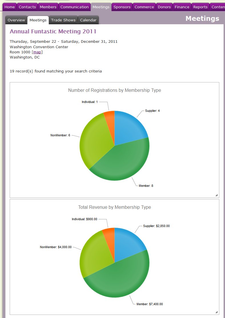
Why Are Infographics So Hot?
Version 13.2 of MatrixMaxx was released last week and it had several notable, new features related to visualization. The first is an infographics builder that lets clients chart meeting registrations against membership data and individual demographics. For example, a client might chart meeting registrations by member type, job level and job function. The second is a dynamic mapping feature that lets clients take a data set and map it. Let’s take the meeting example again. Clients can now push a button to see the spread of meeting attendees across the US.
Why this emphasis on visualization?
I believe that in this age of big data, we’re drowning in statistics and reports, but we’re starved for insight and trends (sorry for the mixed metaphor). Our CRM (customer relationship management) and AMS (association management software) systems are tracking all kinds of demographic data and transaction history but what are we really learning about our customers?
If I have a list of 1,200 meeting attendees, organized by last name, company or state, I have a roster. A report that gives me total attendees by state will show me where my attendees are coming from. If I plot that data on a map, I might learn that most of my attendees are coming from the coasts or the southern states. Now imagine if I took the same list and plotted it against industry, type of business, job level or number of plants, what would I learn that isn’t at all obvious from looking a list of attendees?
Ever notice how your boss or your Board is always asking for charts and graphs? It’s usually because they’re cold on an issue and summary data, along with visualizations, can give them the 20,000 foot view they need to make strategic decisions.
Here are some example of amazing visualizations that tell a great story:
- The State of the Internet shows us how far we’ve come, how much time we spend online and where that time is going. http://www.pcmag.com/article2/0,2817,2413424,00.asp
- Method, a design and branding agency, mined Google to figure out what consumers were searching for when looking for a tablet, and created a consumer interest infographic to display their findings. http://www.fastcompany.com/1790942/infographic-day-what-do-people-want-tablet-computer
- 512 Paths to the White House shows what outcomes President Obama or Mitt Romney would have needed to win the 2012 election, and the ways they could win. http://www.nytimes.com/interactive/2012/11/02/us/politics/paths-to-the-white-house.html
- The AIDSVu project uses infographics to highlight the impact of the disease on specific populations, e.g., African-Americans or Latinos. http://www.aidsvu.org/national-black-hivaids-awareness-day-2013
My prediction: infographics and visualization tools will continue to grow and dominate our thinking and analysis.
-

How Can Your Organization Use Crowdsourcing To Increase Member and Customer Benefits?
My family went to New York for Spring Break. During the obligatory visit to the flagship FAO Schwarz store, my husband caved and bought our 8-year old a LEGO Minecraft kit. Don’t know about Minecraft? As far as I can tell, Minecraft is THE hot game for boys, who play it on computers, tablets and phones, basically any device they can get their hands on. Minecraft is a game that allows players to build anything out of blocks (buildings, lakes, plants, etc.). At night, the zombies come out so your house or castle better be safe. Anyway, back to my story. We shelled out $44 for a LEGO Minecraft that wasn’t designed by LEGO.For the past few years, LEGO has been accepting models from amateurs through their Cuusoo crowdsourcing platform. The model is simple enough: anyone can build and share a model. If your model gets 10,000 supporters, LEGO HQ reviews it and decides if it should become an official product. If your model goes into production, you get 1% of total net sales. Is that crazy or what? LEGO has managed to tap into the creative consciousness of its loyal fan base, who will undoubtedly bring their knowledge and interests to LEGO, at nearly zero cost to LEGO. Think of the buzz that a new kit has already generated by the time it reaches 10,000 supporters. That’s 10,000 nearly guaranteed sales! More craziness: my 8-year old has already brought his Minecraft kit to school for show and tell and he’s made a YouTube video that will join the thousands of other YouTube videos on Minecraft.
The question is, how can non-manufacturers use crowdsourcing to generate new product ideas, generate customer and member love, and increase revenues? Here are some ideas:
- Many professional societies accepts submissions to speak at a conference. These submissions get reviewed and voted on by an elite panel of members. What if the society blew open the submission process and let the entire membership vote? The top submissions would then get to speak at the conference.
- How about a soliciting ideas for publications and research to be funded by your Foundation? And then let the membership vote and you fund the top vote getters.
- Want to connect with your members? Ask them what topics they’d like your CEO to address during a live chat or in blog posts, then get the membership to vote on the topics. Your CEO would then address the top topics during a meeting, call or in blog posts.
- Thinking about staff retention? Ask your staff for their best non-financial benefits and rewards and then get the entire staff to vote.
It’s easy to associate crowdsourcing with websites like KickStarter, where entrepreneurs submit their ideas and people support the ideas with their money. But I think crowdsourcing can be a powerful engagement tool for organizations of all sizes, in all industries.
-
Certified Financial Planner Board of Standards Website Redesign
Certified Financial Planner Board of Standards, Inc. (CFP Board) was founded in 1985 as a 501(c)(3) non-profit organization that serves the public interest by promoting the value of professional, competent and ethical financial planning services, as represented by those who have attained CFP® certification. CFP Board sets and enforces the requirements for CFP® certification.As THE premier certification organization for financial planners, CFP Board needed to redesign its website to:
- Educate financial planners on the importance of CFP® certification and encourage them to become certified
- Keep current CFP® professionals informed about the requirements for maintaining their certifications
- Position CFP® certification as the financial planning industry standard to a broader audience
Matrix Group worked with the organization to revamp their website. The new site:
- Features an improved “Find a CFP® Professional” tool.
- Is mobile friendly!
- Is built in the Sitefinity content management system and integrated with netFORUM, CFP Board’s certification database.
-
Using Icon Fonts in Web Design
Recently I was reading Paul Boag’s “Breaking free of the print design mentality” blog post where he asks the question, “How can you create a compelling design that works just as well across all of these canvas sizes? To many this sounds impossible.”
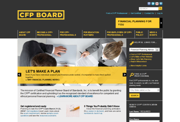
One way I try to create designs that will work anywhere is to use icon fonts. You are probably already familiar with regular icon fonts on every machine, like Wingdings or Webdings, but icon fonts can do so much more on the web.
 Some of the icons in Wingdings, an icon font on most machines
Because they are fonts and essentially vector information, these icons scale perfectly at any resolution—making them worry free when it comes to designs seen on retina displays. Designers don’t have to worry about 2x pixel sizes or spend extra time making separate images for different displays.
Another advantage of using icon fonts is that you don’t have to make new images if you want to quickly change the color—it is all done in CSS. For a client site that allows the user to change the color of text, they are also able to change an icon’s color with no hassle.
A List Apart discusses even more advantages to symbol fonts, from ligatures to increased accessibility. Roger mentions Stately in a previous Snack O’Clock post—an icon font of states you can use for an interactive map.
The best part about icon fonts is that it is simple to make your own! I use Icomoon, which lets me upload an SVG and make a font of the glyphs I want to use.
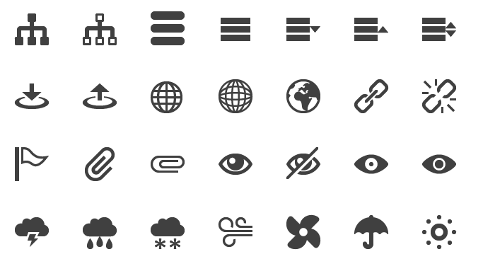
Some icons from Icomoon Here at Matrix, we have launched several sites using icon fonts: NECA‘s responsive site uses icons in the page headers, so they are perfect at every size. The American Counseling Association’s main site and conference site both use icon fonts for social media images and small icons. FMI2014‘s colorful site uses icon fonts not just for social media, but as an overall part of the branding in the headers.
While icon fonts are becoming more popular because of design trends like “flat design“, this is just the beginning of uses for scalable images on the web.
What are your favorite responsive design techniques and tools?
-

Evernote
I love this note taking and organization app. It syncs between my laptop, iPhone, and iPad and I can access it from anywhere. I can even share my notes with friends or staff!
-
How To Get Your Brand Pages Ready for the New Facebook News Feed
 Earlier this month, Facebook announced that users’ home page will soon be transformed into a revamped newsfeed. If you’re the administrator for a brand page, here are some things you should know about the new News Feed.
Facebook Will Let Users Choose the Feeds They Want To See. Today, Facebook tries to guess what posts, images and links will most interest you. It’s called EdgeRank and it’s based on a complex algorithm that’s based on four factors: whether you’ve interacted with a friend or brand before (including frequency), other people’s reactions to a post (i.e., if lots of your friends are commenting on a post, chances are you’ll see that post in your feed), your interactions with posts of that type in the past (i.e., if you seem to like photos, you’ll see more photos), and whether or not a post has received complaints. With the new News Feed, Facebook will let you choose the feeds you want to see: Friends, Photos, Music, Following, Games, etc. So is EdgeRank dead? At least a few Facebook experts think so.
Images and Video Will Rule. The Facebook News Feed will be all about photos and videos. Newsfeed will be bursting with large images and videos, including videos from third party sites. As I’ve noted above, Facebook will let users view just photos from friends and pages they like. So what happens if your organization tends to post Facebook updates with no images? Your updates will probably be largely ignored. Bottom line: think big, bold images because they will dominate the News Feed.
Third Party Content Regains Status. If you’ve got great content on a blog, community site, YouTube, Pinterest or Instagram, for example, Facebook will let you feature those links and posts prominently, especially if they have nice images.
How to get ready for Newsfeed?
- Read more about the new Facebook News Feed
- Join the waiting list so you’ll be one of the first to get Newsfeed. Go here and scroll to the bottom of the page.
- Have a photo strategy for your website and your Facebook posts.
Are you ready for the new News Feed? It’s coming and you want to be sure that your followers continue to WANT to read your posts and allow your posts to be featured in their feeds.
-

5k Fridays
Crystal City’s 5k Fridays are a great way to kick off the weekend. Matrix staff love running these races together every spring.
-
American Counseling Association Website Redesign
The American Counseling Association (ACA) is a not-for-profit, professional and educational organization that is dedicated to the growth and enhancement of the counseling profession. Founded in 1952, ACA is the world’s largest association exclusively representing professional counselors in various practice settings.
ACA needed to redesign its website to support the demanding needs of counselors who serve in various practice settings worldwide. Members told ACA they wanted:
- A more robust search to find things quickly
- An easier way to complete tasks, e.g., renewing memberships, registering for courses and conferences, etc.
- Easily accessible resources to help counselors with their daily work and career advancement
- A website that explains who counselors are, how they help clients, and why they fill an important need in our communities
To help ACA reach their goals, Matrix Group:
- Created dynamic topic pages in the Knowledge Center.
- Achieved single sign-on (SSO) between the Sitefinity CMS, the iMIS association management software, Wiley Publishing and Higher Logic’s community platform.
- Made the website mobile-friendly through responsive design
- Created a tutorial that introduces visitors to the site and teaches them how to use the site to get the most out of their membership.