Our CEO, Joanna, sits in on site reviews, and she sometimes sends us back with edits because the contrast is way too low. She freely admits that her vision’s getting less sharp as the years go by, and if she’s got problems with contrast, other people will, too.
The biggest eye-opening moment for me was when another Matrix employee, Sarah, and I were quibbling over a design element that was misaligned on a site we were building. As a designer, I could see it clear as day, but as a front-end developer with some visual impairments, she simply could not see what I was talking about. She then flapped her hands – her go-to “stop stop stop!” gesture – and told me to put her glasses on to see what the world looked like with her eyes. And WOW did that change my perspective on things! It got me thinking, if Sarah couldn’t see that, what else can’t other people see on the sites I’m designing?
And it’s not just visual barriers we need to keep in mind, though those are the most obvious to a designer. Accessibility also needs to account for a wide range of challenges. These are just some of the main things we think about on the long list of W3C’s Accessibility guidelines:
- Those who can’t use a mouse with precision due to conditions such as Parkinson’s Disease, stroke, cerebral palsy or even a temporary condition like a broken arm, require sites that have much larger click targets.
- Transcripts for podcasts or videos will be needed for people with auditory conditions.
- People who suffer from photosensitivity-triggered epileptic seizures have problems with flashing objects and must be so relieved that blinking, spinning, over-animated text is a thing of the past.
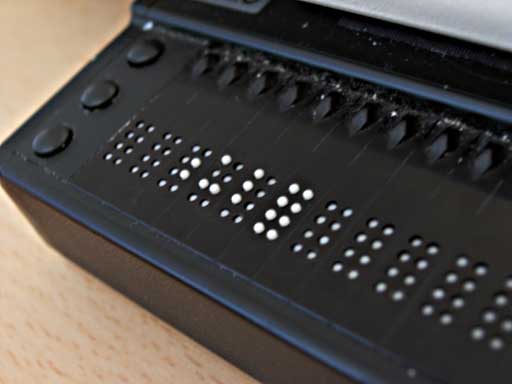
- Buttons should be specifically named instead of simply “click here” to help provide people using refreshable braille displays with more context.
- Contrast is one of our biggest culprits. So much so that I’ve been running everything through a trusty contrast checker to make sure everything I design is now legible to all.
- Attention disorders, dyslexia, learning and cognitive disabilities all benefit from visual clues such as icons paired with text, or different font and spacing decisions.
- We also need to keep the paragraph line length in check for this audience. As desktop sites get wider and wider, this is easily forgotten because there’s so much room! We don’t need to fill the available space. We need to keep this in check at 80 characters, otherwise it becomes very hard to keep your place while reading.
Luckily, all these things also help simply distracted, impatient people. We all know a few of those, right? Which really is kind of the point of all this: making websites more accessible for users with impairments ultimately enhances the user experience for our audience as a whole and simply benefits everyone.
Except for me. These things make my job as a designer substantially more challenging.
It’s a good thing I like challenges.
What’s the biggest accessibility challenge you face, day-to-day?
