Matrix Group International

Category: Blog

  • The Great Banana Bread Experiment: Are People Really Reading Your Emails?

    The Great Banana Bread Experiment: Are People Really Reading Your Emails?

    bread_500pxA couple of weeks ago, I sent out an important message to my entire staff about IT support. We had recently put in some technologies to make it easier for staff to request IT support during business and non-business hours, and some of our procedures had changed. The subject line began with PLEASE READ, and it came directly from me, Joanna Pineda, CEO and the person who signs everyone’s paycheck.

    The email was longish so I decided to do a test. At the very bottom of the email, I wrote:

    “BTW, if you read all the way down to this message, send me an email with the words “banana bread” in the subject line. I’ll bring in banana bread for you next week and for God’s sake, don’t give this away on Slack or any other method. Curious to see how many people will read this message. Cheers.”

    So how many people sent me a banana bread email? Out of 40 people, seven people sent me emails. Seven – that’s it!

    To be fair, the IT team already knew the procedures. And I had discussed the procedures with a few staff before sending the emails.

    kate_bread_smDuring staff meeting last week, I asked everyone if they had: read but not responded, skimmed and not read my banana bread message, or if they didn’t read the message at all. I gave everyone amnesty if they told me the truth. I got these responses:

    • I already know the policies
    • I skimmed the part about the policies to make sure I knew what I needed to know
    • Too long, didn’t read
    • I don’t like banana bread
    • I didn’t see the email

    I conducted a similar experiment a couple of months back when I sent an email to my son’s Cub Scout pack, of which I’m the committee chair. The email contained information about the next pack meeting, an upcoming camping trip… Yada, yada – if you’re a Scout parent, you understand me. At the bottom, I said:

    “Okay, thanks for reading this far. If you got this far, email me and put the word “magnet” in the subject line and I’ll give you a Friends of Scouting magnet at the next meeting.”

    Out of 60 people on the list, three responded. Two said they’d take a magnet and one said, “Magnet – but I don’t need a magnet. What fun!”

    I know this wasn’t a scientific test, and the emails weren’t life or death, but I think these experiments are pretty illustrative of what really happens when we send out emails. We look at our open and click rates and pray that those who opened actually read the message. Are they actually reading your message in its entirety? God, most likely not.

    What are the takeaways here? For starters:

    • Keep your emails short(er)
    • Don’t bury important calls to action at the bottom of your message
    • Test your campaigns

    If you’ve read all the way to the bottom of this blog post, submit a comment on this post using the word SWAG, and I’ll send a Matrix Group pen to the first 25 people. And if you decide to bury an Easter Egg in your next email newsletter, please write the results of your experiment in the comments as well or send me an email.

  • Web Accessibility and Keeping Others in Mind

    Refreshable_Braille_displayWebsite accessibility has been on my mind recently. A few years back, one of the biggest trends on the web was subtlety. Medium gray text on light gray backgrounds, super-thin fonts, etc. all looked quite elegant to designers, but in hindsight they were pretty unfair to the average user. At Matrix Group, we try to be as inclusive as possible, and that means paying attention to accessibility and designing our sites to be as usable by the widest range of people as humanly possible.

    Our CEO, Joanna, sits in on site reviews, and she sometimes sends us back with edits because the contrast is way too low. She freely admits that her vision’s getting less sharp as the years go by, and if she’s got problems with contrast, other people will, too.

    The biggest eye-opening moment for me was when another Matrix employee, Sarah, and I were quibbling over a design element that was misaligned on a site we were building. As a designer, I could see it clear as day, but as a front-end developer with some visual impairments, she simply could not see what I was talking about. She then flapped her hands – her go-to “stop stop stop!” gesture – and told me to put her glasses on to see what the world looked like with her eyes. And WOW did that change my perspective on things! It got me thinking, if Sarah couldn’t see that, what else can’t other people see on the sites I’m designing?

    And it’s not just visual barriers we need to keep in mind, though those are the most obvious to a designer. Accessibility also needs to account for a wide range of challenges. These are just some of the main things we think about on the long list of W3C’s Accessibility guidelines:

    • Those who can’t use a mouse with precision due to conditions such as Parkinson’s Disease, stroke, cerebral palsy or even a temporary condition like a broken arm, require sites that have much larger click targets.
    • Transcripts for podcasts or videos will be needed for people with auditory conditions.
    • People who suffer from photosensitivity-triggered epileptic seizures have problems with flashing objects and must be so relieved that blinking, spinning, over-animated text is a thing of the past.
    • Buttons should be specifically named instead of simply “click here” to help provide people using refreshable braille displays with more context.
    • Contrast is one of our biggest culprits. So much so that I’ve been running everything through a trusty contrast checker to make sure everything I design is now legible to all.
    • Attention disorders, dyslexia, learning and cognitive disabilities all benefit from visual clues such as icons paired with text, or different font and spacing decisions.
    • We also need to keep the paragraph line length in check for this audience. As desktop sites get wider and wider, this is easily forgotten because there’s so much room! We don’t need to fill the available space. We need to keep this in check at 80 characters, otherwise it becomes very hard to keep your place while reading.

    Luckily, all these things also help simply distracted, impatient people. We all know a few of those, right? Which really is kind of the point of all this: making websites more accessible for users with impairments ultimately enhances the user experience for our audience as a whole and simply benefits everyone.

    Except for me. These things make my job as a designer substantially more challenging.

    It’s a good thing I like challenges.

    What’s the biggest accessibility challenge you face, day-to-day?

  • Make Sure You Have Good Inputs Going Into Your Google Analytics

    Make Sure You Have Good Inputs Going Into Your Google Analytics

    Close up of hands on table, one holding tablet with data visualizations on itI was in a meeting with a client last week and he complained that their Google Analytics (GA) reports just aren’t that useful. I asked why, and he said, “GA tells me the top pages visited on my site and that Google is referring a lot of traffic, and that’s about it.”

    Hmm… I decided to get curious.

    So here’s the deal with GA. If all you do is put the code snippet in your header, you’ll get generic data from GA. But if you give GA better input about where people are coming from and why, you’ll instantly get better GA reports. Here’s how to do that:

    • Never, ever send out a URL without UTM codes.

    UTM stands for Urchin Tracking Module. Urchin is the company that created what is now Google Analytics; Google purchased the company many years ago. A UTM tag is a tracking marker appended to a URL, and is recognized by Google Analytics as a dimension. For example, if you send out a link to a new item on your website in an email newsletter, you could use a UTM code for source = 04-17-2016-newsletter. If anyone clicks on that link, GA will report that traffic as having come from your email newsletter. Voila! All of a sudden, you have better tracking and you know whether or not your email newsletter is generating views on your website. Yes, your blast email provider probably gives you open and click data, but it’s most likely not connected to your overall website analytics reporting. Use this handy URL builder from Google to build data-rich URLs

    • Create redirects for your print URLs.

    So what about your convention brochures? You can’t exactly expect readers to type in a URL that has 100 characters. In this instance, you should create a vanity URL for each print piece (e.g., /2016convention for the brochure and convention 2016 for the postcard) and use your CMS to create a redirect for the actual page, with UTM codes that will attribute traffic to the actual print piece.

    • Use Google Analytics Annotations.

    GA lets you add little notes to your GA reports, attached to specific dates. For example, my marketing team enters annotations every time we send out an email newsletter, post a new event on Facebook, etc. This way, if we see a spike in traffic, we can look to see if that traffic might have been generated by something we did. Of course, we then verify using the Source dimensions in GA.

    • Set up Google Tag Manager.

    Google Tag Manager is an upgrade to Google Analytics and it helps you keeps track of the tags on your website and when they are triggered. For example, Tag Manager will let you track whether and how many people are clicking on the slider in your branding area, the number of downloads of your PDF annual report, etc. The best thing about Tag Manager is that once it’s setup, you don’t need to mess with the CSS on your site again; you then use a Google interface to setup tracking.

    You don’t need to be a developer or a CSS wizard to do the things I mention above. I will be blogging in the future about more advanced things you can do with Google Analytics, enhancements that require some programming. But in in the meantime, if you improve your inputs to Google Analytics, your analytics will be better.

    BTW, Matrix Group has an Analytics practice. If you need some training, help with a specific campaign, or help getting started, give us a call.

  • Does Your Website Need a Redesign or Refresh?

    Does Your Website Need a Redesign or Refresh?

    Woman setting before Mac screens, man reaching in front of her to point at something on screenA couple of weeks ago, I attended a meeting with a client who was interested in redesigning their website. “Why?” I asked. The site looks pretty good, the site is mobile-friendly, and the analytics are pretty good. So what’s driving the desire for a redesign?

    The answer: They wanted to make a few changes to the home page, the content throughout the site, and a bunch of the photos. Even though a redesign would have brought Matrix Group a large project, I recommended a website refresh, not a redesign.

    When should a website be redesigned? It’s always going to to depend on the circumstances, but I recommend a full redesign when:

    • The organization is going through a rebranding because of a name change, shift in focus, drastic changes in programs and services or rethinking of its mission and market position.
    • The organization feels that the website no longer represents the organization.
    • The navigation doesn’t have any bearing on what the organization stands for.
    • The design doesn’t reflect who the organization is today.
    • The organization wants to update a large percentage of the content.

    When should a website refresh be done? Again, it’s going to depend, but I recommend a refresh when:

    • The organization is largely the same: same mission, same values, same general program offerings.
    • The website largely works, but it could use some tweaks to the navigation, the images need updating, and the content needs to be refreshed.
    • There are key pieces of the site that don’t work, but they’re not necessarily related to the overall site. For example, many prospects come to us saying that their site search is broken or they need a new member directory or store.

    Sometimes, a client wants to redesign because they hate their CMS and want to move to something different. With a CMS migration, it makes sense not to just to migrate the exact site. Since we’ll be touching every page, it makes sense to ask if it’s also time to rethink navigation, design, integrations and search.

    Matrix Group recently refreshed portions of our website. The analytics on the home page weren’t where we wanted them to be, so we challenged ourselves to update just the home page. It worked. I was also not happy with our Careers landing page. Since we are always looking for the best people, it made sense to redesign just that landing page. During all this, we didn’t do a redesign. We were largely happy with the overall design, navigation, color palette and tone of the content.

    I happen to think it’s important to tweak and refresh your website regularly, at least annually. In fact, some clients do such a good job of evolving their sites that redesigns may be a thing of the past for them.

    What are YOU doing this year? A redesign or a refresh?

  • Why I Traded in My Black Belt for a White Belt

    Why I Traded in My Black Belt for a White Belt

    HapKiDoA couple of weeks ago, I took the plunge and signed up for HapKiDo. HapKiDo is sometimes called the “anti-martial art” because it emphasizes deflection and leverage. HapKiDo techniques use joint locks, strikes and dynamic kicking.

    I’m a black belt in TaeKwonDo. Why embark on another martial art, especially when my TKD journey has just begun and I’m far from expert on the many TKD techniques?  Or, as my husband asks, “Why embark on a whole new journey of pain?”

    The short answer is that I’m curious. The HapKiDo workouts are really intense, the HKD students are really good friends and they have this stance that says “don’t mess with me.” Yeah, I want some of that.

    This isn’t the interesting part of this story.

    What’s more interesting is the story behind my decision to finally sign up. You see, I had been flirting with the idea about six months ago. I took a couple of trial classes, and they were hard, but they were terrific. But I just couldn’t bring myself to sign up. My excuses were myriad and valid to anyone who inquired: “I’m busy enough, the classes are too late, the HKD guys are always injured, yada, yada.”

    But in my quiet moments, when I was honest with myself, those excuses sounded lame. The real reasons were deeper and had more to do with my sense of who I am than with anything else. You see, starting a new martial art means becoming a white belt all over again. It means not knowing anything, making lots of mistakes, looking silly, feeling embarrassed, feeling slow, standing at the end of the line. Was I ready for that? It was going to be uncomfortable and a lot of hard work – who needs that?

    Turns out my martial arts journey parallels my professional journey in many ways. You see, Matrix Group is getting disrupted. A little background: We build fantastic, effective, user-friendly websites, e-commerce sites, customer/member portals, intranets, etc. We’ve been doing this a long time, we’re great at it, you could even say we’re black belts at it, maybe even 2nd- or 3rd-degree black belts. Trouble is, there are about a zillion agencies in the DC area, indeed the country, that look like us. So over the past couple of years, we’ve been undergoing a process of reinvention. Not only have we been asking, “what’s next?” we’ve been working on ways to bake “what’s next?” in to our day-to-day lives. This process has been hard, uncomfortable, even heartbreaking at times. It has meant closing down product lines, saying good-bye to people, and testing out new products and services that will resonate with the company, my staff and our clients.

    In essence, a couple of years ago, we had to become white belts, learn some new skills and get beat up in the process. In the past few years, as we’ve been developing our mobile offerings, we’ve had fits and starts. We’ve changed frameworks, made mistakes, and done things the “wrong” way. But now we’re cruising with mobile. Every website is responsive by default, responsive isn’t taking as much time as it used to and testing is easier. Our mobile app business is booming.

    Being a white belt is hard and frustrating, but it’s also exhilarating. At work and at the dojang (martial arts studio in Korean), I’m learning fast, I’m feeling good, and I’m feeling strong. And it turns out my TKD experience is coming in handy. I have good endurance, I know a lot of the kicks, and I can take a hit. So I’m not exactly  starting from ground zero. And so it goes at work. Our expertise in design, user experience, browsers, database development, and membership databases only benefit us when we build new association membership experiences for a phone. This experience will be a good foundation when we start building virtual reality apps in the next year or so.

    So, what’s my martial arts week like these days? It’s TKD 2-3 times a week (where I’m a black belt and building on what I know) and HKD 2 times a week (where I’m a white belt and everything is new.) It’s a mix that works for me.

    How about you? What will be your white belt experience this year?

  • What Does Kung Fu Panda Have To Do With a Performance Review Process?

    What Does Kung Fu Panda Have To Do With a Performance Review Process?

    What Does Kung Fu Panda Have To Do With a Performance Review Process? | www.TheMatriXFiles.netA couple of months ago, I was on YouTube, and I came across a trailer for the upcoming “Kung Fu Panda 3“. The opening lines are by Master Shifu, who says, “Po, if you only do what you can do, you’ll never be more than you are.”

    I have always been a “Kung Fu Panda” fan, but I was blown away by this line. I’ll repeat it: If you only do what you CAN do, you’ll never be more than you are.

    What the heck does this mean?

    Well, it’s performance review time at Matrix Group and I’m Chief Cheerleader for this process. Only we call our process Performance Management and it’s more a conversation between staff and manager about the kind of year the staff person wants to have, their hopes and dreams, the experiences and skills they hope to achieve, and the person they want to become in the next year, in the next five years.

    In “Kung Fu Panda 3”, Master Shifu tells Po it’s now Po’s turn to be the master and the teacher. Po basically says, “No way, what do I know about teaching and mastering chi?” And that’s when Master Shifu tells him to be more than he is.

    As managers and leaders, isn’t that ultimately our job – to help our staff become more than they are? To be honest, I see some less-than-inspiring goal sheets for the coming year. And that’s not good enough. If my staff aren’t reaching for a stretch year, they will become obsolete in a couple of years, and the same will happen to Matrix Group. So I’ve asked my managers to make sure each production staff person has goals related to learning new languages/frameworks/platforms, beefing up their front-end skills, and building mobile apps.

    If we only do what we can do, we’ll never explore new content management systems, platforms and frameworks; we’ll only bid on projects we can comfortably do; and we’ll never explore the brave, new world of mobile, virtual reality and wearables.

    If you only do what you CAN do, you’ll never be more than you are. Love this.

  • Web Design Can and Should Be CMS-Agnostic (and why we love WordPress more and more)

    Web Design Can and Should Be CMS-Agnostic (and why we love WordPress more and more)

    webdev_smHere at Matrix Group, we use a variety of platforms and frameworks to build client applications. On the content management system (CMS) side, we really like Sitefinity and WordPress for building websites, although we have worked with other platforms, including DNN, Expression Engine, and Kentico. WordPress has come a long way in recent years, and we’re doing more and more with it. We love its flexibility, extensibility, and clean code, to name just a few things.

    During a client meeting the other day, I was pitching doing a magazine website in WordPress. The client was surprised and said, “WordPress, the blogging CMS? Isn’t that too simple for our needs?” I explained that no, WordPress has come a long way, it powers so much of the web these days, and it is perfectly capable of the complex functionality she needs. She countered with, “So show me a site that you did in WordPress that doesn’t look like a WordPress site.”

    So I did. I showed her Endocrine News, the magazine of the Endocrine Society, the website for e-discovery firm eTera Consulting, and a convention site for the National Electrical Contractors Association.

    But then I got curious. Does my front-end team design differently based on the CMS platform? I asked my Creative Director and Senior Designer, “Do you take CMS into consideration when creating designs?”

    The response: “Heck no, half the time, we don’t even know the platform that will be used.”

    So then I asked my Lead Front-End Developer, “Does the CMS platform affect what we can and can’t do?”

    The response: “Nope. Some things are easier in WordPress, other things in Sitefinity. Just depends.”

    I know I’m involved in many Information Architecture projects, and I no longer wonder if a platform can do something I’m envisioning in a wireframe.

    I hadn’t really thought about it but it appears we are now CMS-agnostic when it comes to designing the front-end of our websites. Does that mean every CMS can do everything? Probably, at least in the arena we play in. But we definitely express favorites, and choice of platform can affect HOW a specific requirement is implemented, as well as price and timeline.

    Makes me think of a wise client who said to me some time ago, “Joanna, I don’t care what system you use to build my site, as long as it does what I want, it’s easy to use, and you can maintain it easily.”

  • Why Your House, Office, and Website Need a Refresh and Spring Cleaning Every Year

    Why Your House, Office, and Website Need a Refresh and Spring Cleaning Every Year

    Why Your House, Office and Website Need a Refresh and Spring Cleaning Every Year | www.TheMatriXFiles.netA couple of weeks ago, I held a Town Hall meeting with my staff to discuss office space. Our office lease is expiring in less than 2 years, so our Realtors recommended that we look at space around town but also consider how we would like to improve our current space should we decide to stay. During the Town Hall meeting, I asked staff for their blue-sky ideas. If time and money were no object, what would our office look like? How would it be configured? How would it encourage the type of interactions and collaboration that we seek? How do we meld cool with functional?

    We came up with some ideas that are probably way out of our price range. Everything from a completely configurable office with movable walls, desks and chairs, to blowing out the ceiling, to all-glass walls that provide privacy with a push of a button.

    But we also came up with ideas that are totally within reach. Today. With minimal budget. So we have set about implementing many of the ideas because, regardless of whether or not we move, we’re going to be at 2711 Jefferson Davis Highway for another 18 months. We might as well improve our working space. What have we done? We:

    • Gave the kitchen a makeover by putting in matching furniture, tossing out the clutter, and reconfiguring the storage space.  We also put in some new artwork.
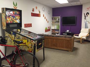
    • Cleaned up the game room and made it cool again. Honestly, it was looking downright dumpy and not fun-friendly.
    • Created a new space for the morning stand-up meetings. One where we can actually stand and write on the walls.

    If you’ve been following my blog all these years, you know that I often draw parallels between managing a website and managing a home or office. Here’s what our new office envisioning process reminded me:

    • Don’t wait until you need to do a major redesign to make improvements to your site. Think in terms of optimizing and improving sections of your site every quarter. At Matrix Group, we take a section of our site, review the analytics and make tweaks every quarter.
    • Declutter on a regular basis. Old, outdated content and run-of-the-mill clutter is deadly. After a while, you don’t even see it anymore. So on a regular basis, look at your website with fresh eyes. Is your website just a dumping ground for old content? Get rid of it. Old content simply clutters your search results, confuses visitors and makes your site feel outdated.
    • Ask your staff and members what’s working and what’s not. Get a few concrete ideas for making individual sections or a page better, then act on them quickly. Be sure to let your stakeholders know that you listened and implemented some of their ideas.
    • Experiment with inexpensive ideas to test out different concepts. For example, my staff have asked for different collaboration areas. But they’re also asked for isolation rooms where they can work uninterrupted for periods of time. Before we invest in construction, we’re testing out some ideas using empty office space. Before investing a lot of money in community tools, databases, etc., think of el cheapo ways to test out ideas.
    • Paint does wonders. It’s been a couple of years since we painted walls and touched up scuff marks. It’s amazing what a fresh coat of paint will do to a space. Same goes for your website. Update the photos. Redo some headers. Update the tired conference template. Your members will notice and pay attention to your marketing messages with fresh eyes.

    I’m going out with the Realtors this week to look at space. I don’t know what the Matrix Group office Version 5 will look like, but I predict there will be lots of purple.

  • Why Your Organization Needs a Mobile App Strategy

    Why Your Organization Needs a Mobile App Strategy

    Man holding smartphoneStarting early this year, I have been urging clients to consider a mobile app. Not just a responsive website, which should be a given these days, but native iOS and Android apps.

    Why?

    The reasons have been building up over the past couple of years, but I became convinced because of several things.

    • Earlier this year, Comscore reported that the percentage of mobile-only Internet users in the US is 11.3% of Internet users. Even more significant, mobile-only users now exceed desktop-only users, who now represent only 10.6% of Internet users, down from 19.1% in March 2014. This mobile-only population is used to interacting with the world on a smaller screen and usually with no keyboard.
    • Here’s the statistic from analytics firm Flurry that really surprised me. When people use their phones or tablets, 90% of the time spent represents interactions with apps, NOT a browser. BTW, 17% of time spent is on Facebook (big surprise, right?) and 32% is spent on games.

    These stats support a presentation made by a couple of interns at Matrix Group this summer. These two college-aged women confirmed that they almost NEVER interact with a browser. Instead, they rely on apps.

    And while Gen-X me still gets on my computer at home in the evenings and weekends for everything from email to working on proposals or looking for recipes, my millennial employees tell me they pretty much don’t crack open a laptop outside of work unless they are working. For casual interactions, they rely ONLY on their phones.

    I have to admit that in many cases, native apps are better designed and more focused. I dislike the weather.com website because it’s too cluttered and confusing, but I adore their app. It’s also super easy to just find the app on a phone and click it, versus pulling up a browser, typing a URL and waiting for the site to load. I have a feeling I’m not alone in thinking this, and this is why so many prefer apps to browsers.

    So with 2016 around the corner, I ask you all: What’s your organizations’ mobile app strategy? What audience(s) could you better reach with an app (or two or three)?

  • Data-Driven Decision-Making Through Analytics

    Data-Driven Decision-Making Through Analytics

    Data-Driven Decision-Making Through Analytics | www.TheMatriXFiles.netA couple of weeks ago, I had the pleasure of moderating a discussion with Tim Martin and Jessica Katz of the Carnegie Endowment for International Peace. Tim is Digital Director and Jessica is Web Manager & Developer at Carnegie.

    Carnegie has a well-developed analytics program, the organization respects data, and Tim and Jessica are committed to using analytics to guide their work. Some highlights from the webinar:

    You’ve Got to Understand Your Goals. Tim and Jessica are adamant that you must first understand what your organization is trying to achieve and what constitutes success before embarking on an analytics initiative. For Carnegie, it’s all about getting people to read their publications: op-eds, commentary, analysis, etc. Carnegie isn’t trying to get people to join, donate or register, it’s all about reading the articles so in their analytics, they look at what drives people to the site, where they are coming from, what they are reading, how far down the page they’re scrolling, etc.

    Most Visitors Go Direct to Content. Carnegie refers to their visitors as converted or unconverted. Converted visitors have signed up for something, they have provided an email, they have opted in to receive something. It turns out that for converted visitors, they don’t come to the website to surf randomly. Converted visitors rely on email and social media to direct their surfing and, what’s more, they go direct to content. Yep, they pretty much bypass the home page. Even the search engines drive visitors directly to articles and NOT the home page.

    The Home Page is for the Unconverted. So who goes to the home page? The unconverted or the persons who want to know more about Carnegie, what it does, and what it represents. For this audience, the goals are to: educate them about Carnegie and get them to convert. But here’s the really big thing: by reducing the call to action, they vastly simplified the home page and created an elegant and bold home page that consists of about a half dozen stories with dramatic imagery. The home page is no longer the newsy page it used to be and that frankly looked like sister and competitor organizations. The bold home page invites exploration and conversion.

    Optimize What’s Important. Since article pages are what the site is all about, Tim and Jessica are constantly looking for ways to optimize their article pages. Here’s a sample article page about Ukraine. Everything from the summary at the top, to the Comment and Share button, are researched and optimized. Every detail is intentional.

    Go Beyond Yay! Traffic! Most organizations are content to look at their analytics, see that their traffic is growing, and never go beyond that. Tim and Jessica recommend mining GA to find out where people are coming from, what they searched for, etc. Jessica recalls doing a deep dive into a spike in traffic that resulted from a mention in a Polish newspaper. Careful cultivation of the newspaper and other organizations in Eastern Europe have resulted in a new digital series and healthy traffic growth from that part of the world.

    Start with Event Tracking. Tim and Jessica closed the webinar by talking about how it’s taken time for the organization to get where they are today. It’s taken careful setup of the custom variable and reports and thoughtful cultivation of Carnegie experts and senior leadership. If your organization is just starting out, they recommend setting up Event Tracking, which is a method available in the Google Analytics (GA) tracking code (we recommend Tag Manager) that you can use to record user interactions with website elements. For example, you can track PDF downloads, clicks on related articles, clicks on the Print button, scrolls down lengthy pages, etc.

    Check out the Carnegie Endowment website to see the fruits of all this intentional and well-researched design and development.

    How about you? How are you using analytics to guide your decision-making? What do YOU wish you could track? What’s working? Please share!