Matrix Group International

Month: June 2016

  • Getting Started with Facebook Live

    Getting Started with Facebook Live

    A couple of Saturdays ago, my friend, co-worker and Director of Biz Dev, Bryan Clark, was taking his first-degree TaeKwonDo black belt test. I was attending as a black belt to help with the sit ups and push ups, to cheer Bryan on since he’s my sparring and workout buddy, and to post updates to the studio’s social media pages.

    In the past, I’ve taken photos and videos and posted them to Facebook in a continuous stream during the event. As I was leaving work on Friday night, a co-worker asked me to wish Bryan good luck and please stream the test live so she could watch from Pennsylvania. Live stream? Could I do it through Facebook Live on Be Ryong’s Facebook page? I decided to give it a try.

    Over the course of the next three hours, I live streamed snippets of the test, I took photos, I shot video, I used my iPhone 6 and my DSLR camera to document the test, and I helped out with the test. I texted friends and co-workers to let them know I was live streaming the event, and I posted updates to Bryan’s Facebook page to let HIS friends know about the test and the live updates.

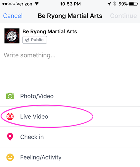
    Facebook Live is ridiculously easy to do. From your personal page or a brand page that you manage, press Publish, then select Live Video.

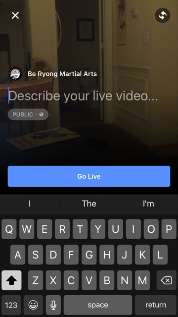
    You’ll be asked to enter a description. Once you’re ready, you click Go Live. Yes, it’s that easy.


    FBlive-circle_sm FBlive_2

    Things I Learned

    Here’s what I learned from using Facebook Live during the test and during a few classes since then:

    • Be sure to advertise that you’ll be streaming your event live well in advance of the event so that people know to tune in. The decision to live stream was sort of made on the fly, and I could have built up excitement and views if I had done more promoting ahead of time.
    • Make sure you have a good Internet connection. Turns out that one side of the studio had better WiFi than the other, so I stayed on the good side. When I ventured to the bad WiFi side, the video suffered.
    • Have a stand or other means for holding your phone or tablet up and steady. Because I was holding my phone and panning to get the full layout of the studio as the students moved around, the video got a little shaky at times. If I had had more time, I would have set up my phone on a stand in one part of the studio and just occasionally zoomed to get better coverage of a student or routine.
    • Your video will be live in near real time, but not instantaneously. Out of curiosity, I asked a friend to check the studio’s Facebook page while I was live streaming. We discovered the stream was about 30 seconds behind, which we thought was pretty darn great. I remember the days of needing a fiber or satellite connection, a camera, a real-time encoder, yada, yada. And here I was, live streaming with my phone!
    • If you want a copy of the video, shoot the video with your phone or camera, don’t live stream it. I didn’t realize it until later, but I ended up without a local copy of the videos I live streamed because they were uploaded directly to Facebook.
    • If you want HD video, shoot the video from a quality digital camera. The quality of the live stream is good but not HD. Some of the streams were actually fuzzy. So for the breaking part of the test, I chose not to live stream. Instead, I took HD videos and then uploaded them afterward to Facebook. The quality is better, AND I have copies to give to the students.
    • For short bursts of activity, you can choose to live stream OR shoot video and then upload. Uploading video to Facebook is so ridiculously easy, especially if videos are a couple of minutes or less. For these short videos, Facebook Live is less compelling.
    • Facebook will archive your live streams so even if your followers don’t watch in real time, they can still watch on demand.

    All in all, Facebook Live is fabulous tool for live streaming your events. Want family overseas to watch your daughter’s wedding from afar? You can live stream on Facebook. But just be sure get a quality, HD archive as well.

    If you want to see samples of Facebook Live streams from the black belt test, visit the BeRyong Facebook page. I’d love to hear about your Facebook Live adventures!

  • Using UTM Codes for Better Google Analytics Reporting

    Using UTM Codes for Better Google Analytics Reporting

    It’s no secret that we’ve been seriously geeking out about everything Google Analytics here at Matrix Group. We’ve been endlessly exploring, experimenting and testing and have been blown away by the amount of invaluable data we’ve been able to collect for our clients, down to the granular who/what/when/where/how/why. We’ve said it before, and we’ll keeping saying it until we’re blue in the face: you simply can’t afford to ignore your analytics reporting!

    Want to start digging deeper but not sure where to start? You’re not alone! Our clients frequently ask us for one or two simple things they can do to get started, and our No. 1 answer is: start with UTM codes.

    UTM codes are code snippets that you can attach to custom URLs that track a source, medium, and campaign name. This information gets passed to Google Analytics and identifies where your traffic is coming from and what campaigns are driving the traffic. Invaluable data!

    Here are a few of our top tips for using UTM codes:

    • Create a spreadsheet to track codes and campaigns. Having everything planned out and stored in one place will not only help you visualize your whole campaign, but it will also ensure more accurate reporting, especially if you have multiple staff members working on one campaign.
    • Keep your tags consistent. UTM codes are case sensitive, so make sure you stick to the same permutations of upper and lower case!
    • Use dashes, not spaces, to separate words. While a UTM URL builder will allow you to use spaces, it makes the URL look a lot less clean. Example: “CEO blog post” will become CEO%20blog%20post. Instead, try CEO-blog-post. Doesn’t that look better?
    • Use a URL Builder to create links. These tools are very easy to use and will save you time and heartburn over building the URLs yourself.
    • Use a URL shortener, where appropriate. When you use UTM codes, the URLs can get quite lengthy and ugly. Use URL shorteners to make the links more visually appealing. There are tons of easy-to-use URL shortener tools out there (we like goo.gl), so make use of them!
    • Never send out a link to your site without a UTM code in place!

    Looking for other Google Analytics tips and tricks? Check out CEO Joanna Pineda’s recent blog posts on Google Analytics. There’s some great info there! If you want a little more hands-on guidance and assistance, don’t hesitate to give us a call. We’d love to help you in any way we can. 

    Have any other tips for getting started with Google Analytics? What are your favorite reports and hacks? 

  • The Great Banana Bread Experiment: Are People Really Reading Your Emails?

    The Great Banana Bread Experiment: Are People Really Reading Your Emails?

    bread_500pxA couple of weeks ago, I sent out an important message to my entire staff about IT support. We had recently put in some technologies to make it easier for staff to request IT support during business and non-business hours, and some of our procedures had changed. The subject line began with PLEASE READ, and it came directly from me, Joanna Pineda, CEO and the person who signs everyone’s paycheck.

    The email was longish so I decided to do a test. At the very bottom of the email, I wrote:

    “BTW, if you read all the way down to this message, send me an email with the words “banana bread” in the subject line. I’ll bring in banana bread for you next week and for God’s sake, don’t give this away on Slack or any other method. Curious to see how many people will read this message. Cheers.”

    So how many people sent me a banana bread email? Out of 40 people, seven people sent me emails. Seven – that’s it!

    To be fair, the IT team already knew the procedures. And I had discussed the procedures with a few staff before sending the emails.

    kate_bread_smDuring staff meeting last week, I asked everyone if they had: read but not responded, skimmed and not read my banana bread message, or if they didn’t read the message at all. I gave everyone amnesty if they told me the truth. I got these responses:

    • I already know the policies
    • I skimmed the part about the policies to make sure I knew what I needed to know
    • Too long, didn’t read
    • I don’t like banana bread
    • I didn’t see the email

    I conducted a similar experiment a couple of months back when I sent an email to my son’s Cub Scout pack, of which I’m the committee chair. The email contained information about the next pack meeting, an upcoming camping trip… Yada, yada – if you’re a Scout parent, you understand me. At the bottom, I said:

    “Okay, thanks for reading this far. If you got this far, email me and put the word “magnet” in the subject line and I’ll give you a Friends of Scouting magnet at the next meeting.”

    Out of 60 people on the list, three responded. Two said they’d take a magnet and one said, “Magnet – but I don’t need a magnet. What fun!”

    I know this wasn’t a scientific test, and the emails weren’t life or death, but I think these experiments are pretty illustrative of what really happens when we send out emails. We look at our open and click rates and pray that those who opened actually read the message. Are they actually reading your message in its entirety? God, most likely not.

    What are the takeaways here? For starters:

    • Keep your emails short(er)
    • Don’t bury important calls to action at the bottom of your message
    • Test your campaigns

    If you’ve read all the way to the bottom of this blog post, submit a comment on this post using the word SWAG, and I’ll send a Matrix Group pen to the first 25 people. And if you decide to bury an Easter Egg in your next email newsletter, please write the results of your experiment in the comments as well or send me an email.

  • Web Accessibility and Keeping Others in Mind

    Refreshable_Braille_displayWebsite accessibility has been on my mind recently. A few years back, one of the biggest trends on the web was subtlety. Medium gray text on light gray backgrounds, super-thin fonts, etc. all looked quite elegant to designers, but in hindsight they were pretty unfair to the average user. At Matrix Group, we try to be as inclusive as possible, and that means paying attention to accessibility and designing our sites to be as usable by the widest range of people as humanly possible.

    Our CEO, Joanna, sits in on site reviews, and she sometimes sends us back with edits because the contrast is way too low. She freely admits that her vision’s getting less sharp as the years go by, and if she’s got problems with contrast, other people will, too.

    The biggest eye-opening moment for me was when another Matrix employee, Sarah, and I were quibbling over a design element that was misaligned on a site we were building. As a designer, I could see it clear as day, but as a front-end developer with some visual impairments, she simply could not see what I was talking about. She then flapped her hands – her go-to “stop stop stop!” gesture – and told me to put her glasses on to see what the world looked like with her eyes. And WOW did that change my perspective on things! It got me thinking, if Sarah couldn’t see that, what else can’t other people see on the sites I’m designing?

    And it’s not just visual barriers we need to keep in mind, though those are the most obvious to a designer. Accessibility also needs to account for a wide range of challenges. These are just some of the main things we think about on the long list of W3C’s Accessibility guidelines:

    • Those who can’t use a mouse with precision due to conditions such as Parkinson’s Disease, stroke, cerebral palsy or even a temporary condition like a broken arm, require sites that have much larger click targets.
    • Transcripts for podcasts or videos will be needed for people with auditory conditions.
    • People who suffer from photosensitivity-triggered epileptic seizures have problems with flashing objects and must be so relieved that blinking, spinning, over-animated text is a thing of the past.
    • Buttons should be specifically named instead of simply “click here” to help provide people using refreshable braille displays with more context.
    • Contrast is one of our biggest culprits. So much so that I’ve been running everything through a trusty contrast checker to make sure everything I design is now legible to all.
    • Attention disorders, dyslexia, learning and cognitive disabilities all benefit from visual clues such as icons paired with text, or different font and spacing decisions.
    • We also need to keep the paragraph line length in check for this audience. As desktop sites get wider and wider, this is easily forgotten because there’s so much room! We don’t need to fill the available space. We need to keep this in check at 80 characters, otherwise it becomes very hard to keep your place while reading.

    Luckily, all these things also help simply distracted, impatient people. We all know a few of those, right? Which really is kind of the point of all this: making websites more accessible for users with impairments ultimately enhances the user experience for our audience as a whole and simply benefits everyone.

    Except for me. These things make my job as a designer substantially more challenging.

    It’s a good thing I like challenges.

    What’s the biggest accessibility challenge you face, day-to-day?